Nested Total Bar Chart
The Datellers Nested Total Bar Chart makes total and segment comparisons instantly clear, without visual clutter.
Dual-Layer Visualization
The chart automatically renders both total bars (aggregate values) and nested bars (series breakdowns) when legend data is provided. Total bars span the full category width with configurable transparency, while nested bars use a proportional secondary scale for positioning. This dual-layer approach ensures both summary and detail remain visible simultaneously.
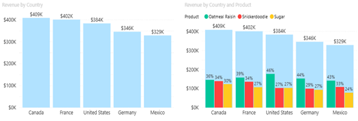
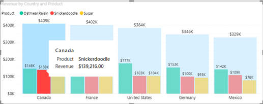
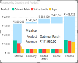
Interactive Selection Capabilities
Users can click any bar or category label to create selections that cross-filter other visuals on the report page. Hold Ctrl while clicking to select multiple elements. Selections synchronize across total bars, nested bars, and category labels, providing consistent interaction behaviour. Click the chart background to clear all selections.
Comprehensive Tooltip Integration
The visual supports both standard Power BI tooltips (displaying field values) and enhanced tooltip pages (custom report pages displayed on hover). Tooltips provide additional context without cluttering the main visualization, supporting detailed data exploration.
User Guide
Learn all the features and formatting options that allow you to use the Nested Total Bar Chart in all its simple yet powerful ways
Sample Report
Discover how the Nested Total Bar Chart can transform your data storytelling with this insightful report showcasing its applications.