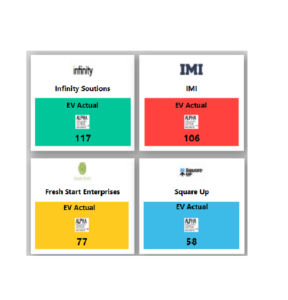
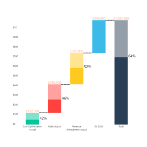
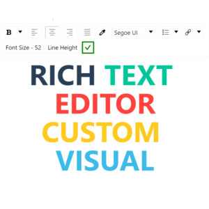
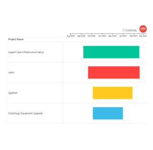
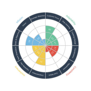
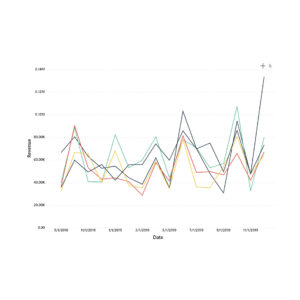
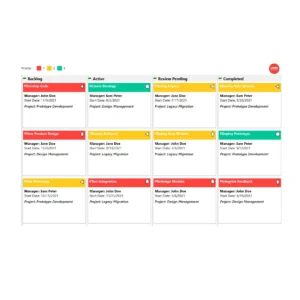
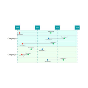
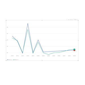
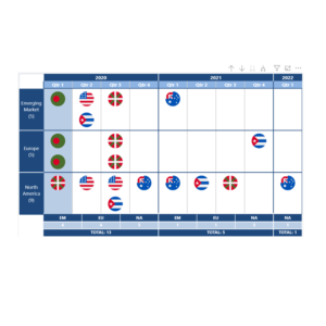
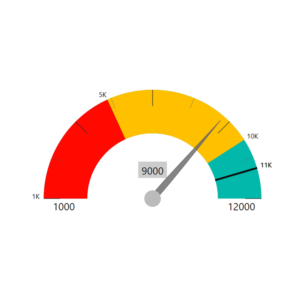
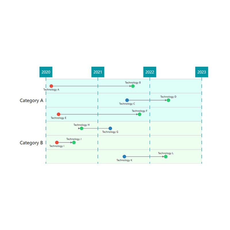
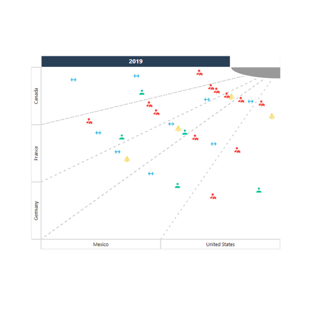
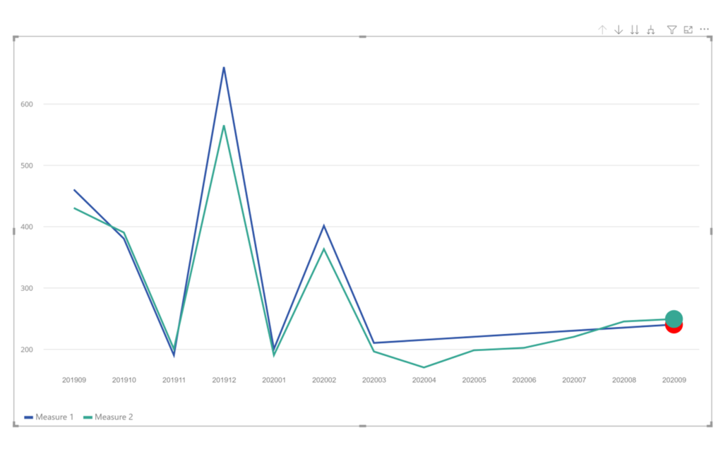
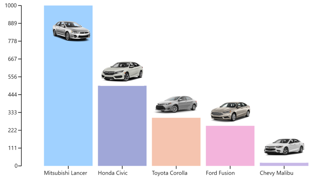
Portfolio

Power Gauge

Proximity Bubble Map

Country Matrix Visual

Proximity Bubble Map

Timeline Power BI Custom Visual

TIMELINE VISUAL

View chronological transitions with ease

A timeline visual that shows the successor node and predecessor nodes of various tasks with dates for each node. The nodes were also categorized inside containers based on a category field. The visual has functionalities like:

TRANSFORMATION MAP

A quick overview of your company’s roadmap

A concentric roadmap visual built for Orbus Software. The visual helps identify Projects based on Date and Category. The user can drilldown to a specific Year, Quarter or Month and analyse the projects for that Quarter in detail. The user could then right-click on any project and Drill-through to get to a Project Report.
Transformation Map Power BI Custom Visual
Laconic Line Chart Power BI Custom Visual

LACONIC LINE CHART

A customized Line Chart Visual

A customized line chart visual specifically built for Laconic Charts. The line chart has problem heads to help identify if a given line element has any problems to observe or not. There can be multiple lines, and each line and head can be specifically customized. The visual has functionalities like:

IMAGE BAR CHART VISUAL

Embed any image in your Bar Chart

A Bar Chart visual that lets the user embed any image to a datapoint via a url in the dataset. The visual has plenty of formatting options created to configure the size or position of any image so that it renders neatly. The key functionalities are:
Image Bar Chart Power BI Custom Visual
Datellers IFrame Power BI Custom Visual

IFRAME VISUAL

Embed frames from external websites in your report

A visual that rendered any website link inside an IFrame when published to Power BI Service. The user show chart residing in external charts inside the report. The visual has functionalities like:

STACK CHART VISUAL

Depicts a building’s floor plan

Created a visual that cleanly depicted the layout of a building/s with all the rooms on each floor. The status of any room could also be set in the visual. The visual has functionalities like:

PROXIMITY BUBBLE MAP VISUAL

Choose the right daycare for a school

A Bubble Chart that represented Schools and nearby Day Care Centres as Bubbles. The visual lets the user to analyze and decide the best Day Care Centre for any School based on various properties embedded in the visual.

COUNTRY MATRIX VISUAL

A highly customized Matrix Custom Visual

A matrix visual that shows countries that are already involved or need to be targeted in any particular category and also in a year, quarter or month. The blue shade bifurcates the visual based on the current date or a target date. The visual also has a custom drill-down functionality built into it. The visual has functionalities like:

POWER GAUGE VISUAL

A radial gauge KPI

The Power Gauge is a radial KPI that let’s you define various ranges. You can set your Target and Actuals in the dial along with pointer values to measure and communicate performance effectively. The visual has functionalities like:
Scroll to Top

Get In Touch

Set up a free Consultation today!