Sunray Chart
The Datellers Sunray Chart makes it effortless to visualize workflows, track progress, and understand performance across every stage.


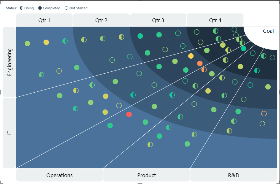
Converging & Diverging Flow
Visualize your data the way it works best. With converging flows, tasks move toward a central outcome, while diverging flows highlight branching paths from one source. This flexibility makes the Sunray Chart ideal for multiple process types, from project tracking to customer journeys
Customizable Node Icons
Improve process visualization with customizable node icons in this Sunray Chart. Assign unique icons to categories, tasks, or statuses in this Power BI custom visual. Icons make dashboards more intuitive, helping users quickly interpret data without relying solely on labels or tooltips.

Drilldown Capability
Unlock deeper insights with interactive drilldown. This Power BI custom visual allows users to zoom into columns, enabling focus at different levels or specific stages or categories, making it easy to track workflows, analyze bottlenecks, and gain clarity at multiple levels of detail within your data visualization.

Drillthrough to Detailed Pages
Connect summary views with detailed analytics using drillthrough. Right-click any node in this Power BI visual to open a dedicated page of insights. Perfect for interactive dashboards, it helps bridge big-picture visualization with granular data exploration.

Custom Sort
Organize your Power BI visuals the way you need with Custom Sort. Arrange tasks or categories by date, score, or custom rules, giving you total control over how your workflow and progress tracking is presented.
