On this page
Contents
- What is a Data Play Visual?
- Data Play Visual Use Cases
- How to use the Data Play Visual in Power BI
- Formatting Options in the Data Play Visual
I. What is a Data Play Visual?
Data Play by Datellers is a premium Power BI custom visual that transforms static reports into dynamic storytelling experiences. Acting as an intelligent slicer, Data Play automatically cycles through your data categories, animating all connected visuals on the report page. This creates smooth transitions between data points, enabling audiences to discover patterns, trends, and insights without manual interaction.
Core Features
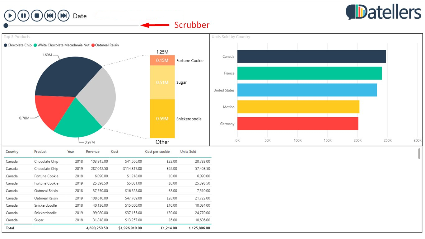
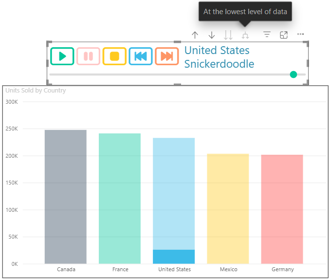
The Scrubber Navigation: Go beyond passive viewing with the interactive scrubber slider. Instantly jump to any specific data point in your sequence, complete with hover previews that show exactly what you’ll see before you land. Perfect for presentations where you need to drill into specific moments or highlight key insights on demand.
Custom UI: Unlike rigid visuals that clash with your report design, Data Play offers complete UI customization. Match every element—buttons, captions, backgrounds, and icons—to your brand colors, fonts, and layout. Dynamic sizing and multiple icon styles ensure flawless integration across any dashboard theme or presentation style.
Complete Control: Master your data narrative with Sort By precision—defining playback order using any numeric measure (sales value, priority scores,) in ascending/descending sequence—plus full Drill Down support seamlessly navigating hierarchies (Region → City → Store, Year → Quarter → Month) while maintaining smooth animations across all connected visuals.
Effortless Storytelling: Automatically sequences through categories, creating compelling narratives from your data.

Universal Compatibility: Works with any Power BI visual as a cross-filtering slicer, animating charts, tables, maps, and KPIs simultaneously.
Structure of Data Play
Category Field: Primary sequencing dimension (dates, categories, stages) that defines playback order.
Sort By Field (Optional): Custom numeric or category field for ascending/descending sort control.
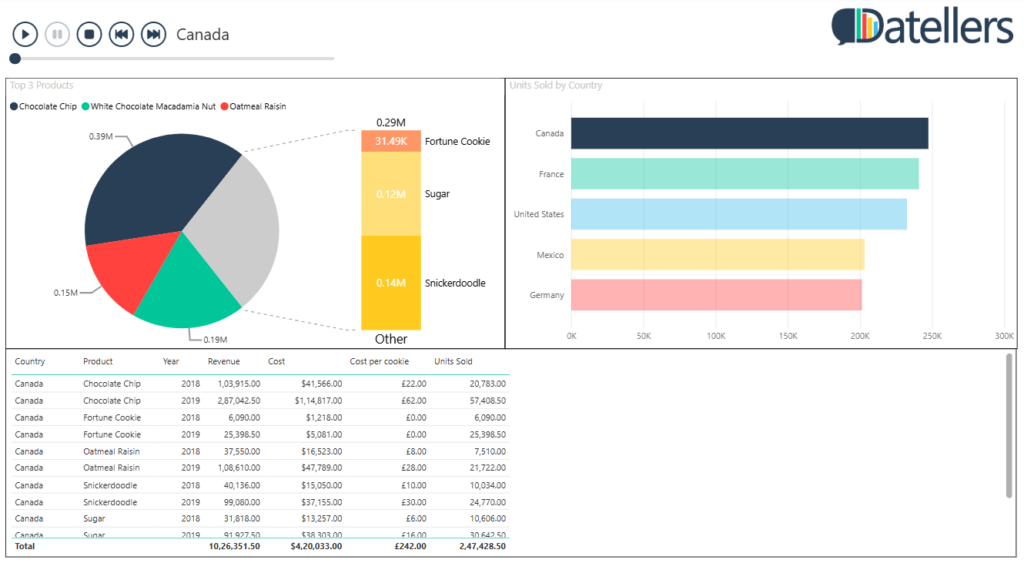
II. Data Play Visual Use Cases
Executive Presentations: Cycle through monthly KPIs, revealing performance trends across time periods while leadership watches insights unfold naturally.
Wallboard Dashboards: Automatically refresh metrics every 30 seconds across multiple visuals, keeping wall displays dynamic without manual intervention.
Training & Walkthroughs: Guide new team members through customer journey stages, product performance breakdowns, or regional comparisons with controlled pacing.
Sales Pipeline Reviews: Animate opportunities through sales stages (Lead → Qualified → Proposal → Closed), visualizing conversion rates and bottlenecks.
Social Media Analytics: Cycle through platform performance (Instagram, LinkedIn, Twitter) to compare engagement metrics side-by-side over time.
Inventory Turnover: Show stock levels cycling through product categories or warehouse locations, highlighting fast/slow movers automatically.
Website Analytics: Animate traffic sources, bounce rates, and conversions through days of week or hours of day for behavioral pattern discovery.
III. How to use the Data Play Visual in Power BI
- Add the Required Data to Data Fields: Data Play requires just one primary data role:
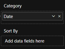
Category: Assign your sequencing field (dates, regions, products, stages). This determines what gets cycled through.
Sort By (Optional): Numeric measure or category for custom ascending/descending order.
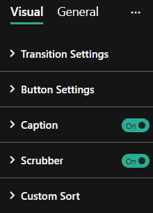
- Explore the Following Features:
- Transition Controls: Auto-start begins playback on load; loop repeats indefinitely; time interval (ms) sets speed (default 1000ms).
- Navigation Precision: Scrubber scrolls to any point; Next/Previous steps manually; Play/Pause toggles auto-advance.

- Universal Filtering: All controls cross-filter page visuals instantly, supporting drilldown hierarchies.
- Order Customization: Use Sort By field or formatting for exact playback sequence.
- Caption Display: Toggle to show current data point for context during animations.
- Minimal Integration: Single-button mode reduces visual clutter on dense dashboards.

IV. Formatting Options in the Data Play Visual
Data Play provides extensive formatting via the ‘Format Visual’ pane for theme-perfect integration.
- Transition Settings: Expanding ‘Transition Settings’ provides the following formatting options:
- Auto Start – Toggle automatic playback on visual load (Off by default)
- Loop – Enable continuous cycling through data points (Off by default)
- Time Interval (ms) – Set transition speed (default 1000ms)
- Button Settings: Expanding ‘Button Settings’ provides following options:
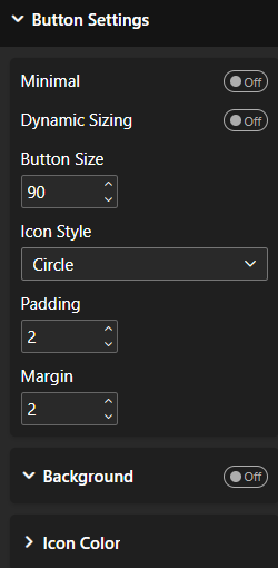
- Minimal – Show only single Play/Stop icon (Off by default)
- Dynamic Sizing – Auto-scale buttons to visual space (Off for fixed sizes)
- Button Size – Adjust button size manually
- Icon Style – Options include Icon, Icon Fill, Button, Button Fill, Circle, Circle Fill
- Padding – Adjust padding around the icon
- Margin – Adjust margin around icons
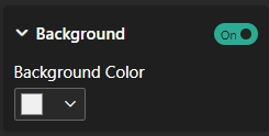
- Background : – Can give button background color
- Icon Colour : On expanding this toggle you can see following:
- Individual Colors: Enable this toggle to give different colours to play, pause, stop, next, previous icons.
- Button Colour: Using this you can give icons colour.
- Caption : Expanding this option you can see following:
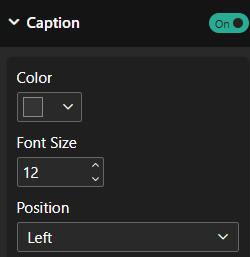
- Color: Can give caption color using it.
- Font Size: Can give Font Size.
- Position: You can align the caption to right, left, or center.
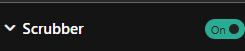
- Scrubber : Using this toggle you can enable or disable a scrubber at the bottom.
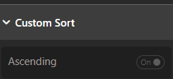
- Custom Sort: Using this toggle you can sort values either in ascending or descending order.