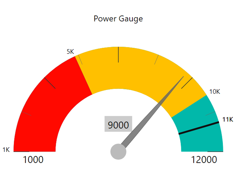
The Power Gauge is a Power BI Custom Visual built for a client project to enhance KPI tracking and performance communication. Unlike standard visuals, it offers a radial dial format that provides an intuitive way to assess progress at a glance. With customizable ranges, pointer indicators, and flexible formatting, this visual helps businesses quickly interpret whether they are meeting, exceeding, or falling behind their targets.
Challenges
While gauge and waterfall charts exist in Power BI, they often lack flexibility for nuanced KPI tracking. Common issues include:
- Difficulty in visually distinguishing performance bands (low, medium, high).
- Limited customization of min/max ranges and pointer styles.
- Lack of clear variance visibility compared to targets.
- Over-reliance on static formats, making real-time KPI evaluation harder.
These limitations make it challenging for organizations to present a compelling financial narrative using only default visuals.
Solution
The Power Gauge was designed to address these challenges by enabling:
- Color Bands: Up to three customizable ranges (default Red, Amber, Green).
- Pointer Needle: Shows exact performance against defined thresholds.
- Min/Max Values: Define custom lower and upper boundaries.
- Text & Labels: Fully customizable text, fonts, and labels for clarity.
- Formatting Flexibility: Adjust colors, bands, and dial styling for branding or reporting needs.
This makes the visual adaptable for financial KPIs, operational benchmarks, or performance monitoring across industries.
Results
By implementing the Power Gauge, the client was able to:
- Track KPIs more effectively using real-time dial indicators.
- Communicate performance clearly with color-coded ranges.
- Empower decision-making through quick, visual insights.
- Enhance report storytelling with a modern and engaging design.
Learn More
- Explore our Sunray Chart product: Check out the Sunray Chart, a powerful strategic roadmap visual from Datellers, designed to uncover hidden patterns and relationships.
- Explore Microsoft gauge visuals: Learn how native gauge charts work in Power BI with Microsoft Gauge Visuals Documentation.