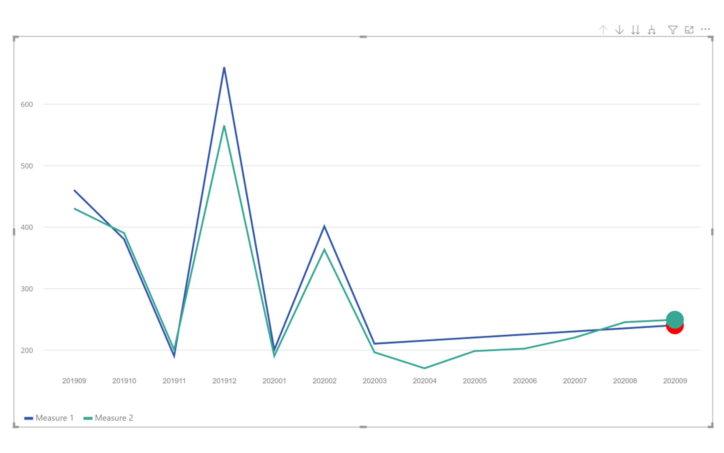
The Laconic Line Chart is a customized Power BI visual specifically built for Laconic Charts. This visual provides advanced functionality to help identify and monitor potential issues within line elements using problem heads. It supports multiple lines, each with individually customizable heads for enhanced analysis and clear visualization.
Challenges
- Overplotting & Visual Noise: Displaying many lines or dense time-series data can make it hard to distinguish individual lines or heads.
- Problem Head Clarity: Designing heads that clearly indicate ‘problems’ without causing confusion or excessive legend dependence.
- Drilldown UX: Preserving context and selection state while drilling down through hierarchical data levels.
- Performance: Rendering many datapoints or complex head shapes may impact responsiveness on large datasets.
- Interaction Consistency: Ensuring selection, cross-filtering, and bookmarking behave predictably within Power BI’s selection model.
Key Features
- Drilldown: Select a data point to drill down to the next level for deeper analysis.
- Dynamic Heads: Options to show, hide, or customize problem heads for each line.
- Completely Customizable: Extensive formatting options to control the width, height, text, and colors of every element.
Results
- Enhanced Insights: Identify problem areas directly within the chart using visual indicators.
- Flexible Analysis: Multiple lines and heads provide a highly customizable and detailed view of complex datasets.
- Professional Reporting: Robust customization ensures the chart fits seamlessly into any Power BI report design.
Explore our Multi Line Chart with Tooltips visual to see another example of insightful KPI analysis in Power BI.
Learn more about Laconic Chart