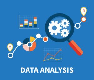
Data visualizations are powerful tools for presenting complex information in an easy-to-understand format. They can be used to communicate insights, trends, and patterns in data, and are essential for decision-making in many fields, including business, science, and public policy. Here are some key facts about data visualizations:
1. Data visualizations are effective tools for communication

Data visualizations are an effective way of communicating complex data in an easily understandable way. This is because humans are visual creatures, and we can process visual information much more quickly and easily than text or numbers alone. By using data visualizations, data can be presented in a way that is easily digestible, allowing people to quickly see patterns, trends, and relationships in the data. This can be particularly important when trying to communicate complex data to a non-technical audience.
2. There are different types of data visualizations:
There are many different types of data visualizations, each of which is suited to different types of data and communication goals. For example, a bar chart is often used to compare discrete categories, while a scatter plot is used to show the relationship between two continuous variables. The choice of visualization will depend on the type of data being presented and the message that needs to be conveyed.
3. Good data visualizations are aesthetically pleasing:

Good data visualizations are not only informative but also aesthetically pleasing. This means that the design of the visualization should be visually appealing and easy to read. This includes things like choosing an appropriate colour scheme, using clear labels and legends, and having a clean layout. A well-designed data visualization will help to make the data more engaging and memorable.
4. Data visualizations can be interactive:
With the advent of new technologies, data visualizations can now be interactive. This means that users can manipulate the data, zoom in and out, and explore different aspects of the data. Interactive data visualizations can be particularly effective in engaging audiences and facilitating exploration and discovery. They can also be used to tell more nuanced stories and to allow viewers to engage with the data in a more meaningful way.
5. Data visualizations can be misleading:
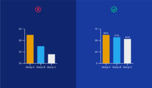
While data visualizations are a powerful tool, they can also be misleading if they are not properly designed. For example, changing the scale on a chart or using a truncated y-axis can make changes in the data appear more significant than they are. It is important to be critical of data visualizations and to ask questions about the underlying data and the design choices that have been made. A well-designed visualization will be transparent about the data and the design choices that have been made.
6. Data visualizations can be used to tell a story:
Data visualizations can be used to tell a story by highlighting important trends, relationships, and insights. A well-designed data visualization can help to guide the viewer through the data and to emphasize key points. By telling a story with data, we can engage and inspire people to take action based on the insights that are revealed.
Also read: The Importance of storytelling in data visualization
7. Data visualizations can be used in many fields:
Data visualizations can be used in many different fields, including science, engineering, business, journalism, and more. They can be used to explore and understand complex data sets, communicate important information, and help make decisions based on data. By using data visualizations, we can make data more accessible and understandable, allowing us to make better-informed decisions based on the insights that are revealed.
Conclusion
In conclusion, data visualizations are an essential tool for presenting complex information in a clear and easy-to-understand format. They can help us identify trends, patterns, and relationships in data, and can be used to communicate insights and inform decision-making. Choosing the right type of visualization, using appropriate design choices, and ensuring accuracy are all keys to creating effective data visualizations. Interactive visualizations can provide even more value by allowing users to explore data dynamically and engagingly.
However, it is important to remember that data visualizations can be misleading if not done properly. It is essential to use data responsibly and present it accurately so that the insights and conclusions drawn from it are valid and reliable. Overall, data visualizations are a powerful tool for unlocking insights from data and communicating them effectively.