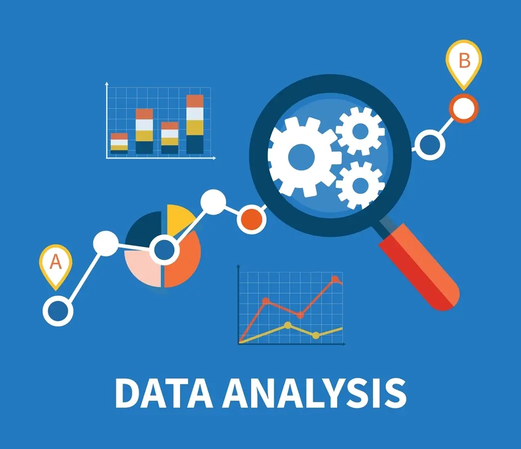
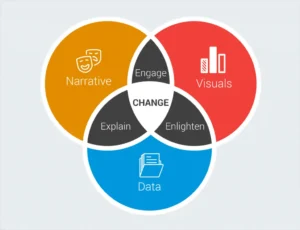
Storytelling in data visualization is a critical aspect of effectively communicating insights from data. The combination of visual representations and storytelling creates a powerful tool for conveying complex information to a broader audience. With storytelling in data visualization, data becomes more accessible and understandable, allowing decision-makers to make informed decisions.
Incorporating storytelling in data visualization involves creating a narrative that explains the data and highlights key points. This narrative can be supported by visual elements such as charts, graphs, and diagrams to enhance understanding. In this context, we will explore the importance of storytelling in data visualization.
Importance of storytelling in data visualization

Storytelling is an essential component of effective data visualization because it helps to bring the data to life and make it more meaningful to the audience. By using data to tell a story, we can engage the audience and convey the insights and conclusions that the data is showing in a way that is more impactful and memorable.
At its core, storytelling is the art of communicating ideas in a way that is engaging, memorable, and meaningful. Data visualization, on the other hand, is about presenting data in a way that is clear and easy to understand. When you combine storytelling with data visualization, you can create a powerful tool for communicating complex information in a way that is both engaging and informative.
Here are some of the key reasons why storytelling is important in data visualization:
- It helps to provide context: Data visualization without context can be confusing and difficult to interpret. By telling a story, we can provide the necessary context and background information to help the audience understand what the data is showing and why it’s important.
- It makes the data more relatable: People are more likely to remember and connect with data when it’s presented in a way that is relatable to them. By using storytelling, we can make the data more relevant and relatable to the audience.
- It helps to convey insights: Data visualization is not just about presenting data, it’s about conveying insights and conclusions. By using storytelling, we can guide the audience through the data and help them understand the insights that the data is revealing.
- It can be more engaging: Storytelling can make data visualization more engaging and memorable. By telling a story, we can capture the audience’s attention and keep them engaged throughout the presentation.
How to incorporate storytelling into your data visualization
Now that we’ve explored why storytelling is important in data visualization, let’s look at some practical tips for incorporating storytelling into your visualizations.
1. Start with a clear message
Before you start creating your data visualization, it’s important to have a clear message in mind. What do you want your audience to take away from the visualization? What is the main point you’re trying to communicate? By starting with a clear message, you can ensure that your storytelling and visualization efforts are focused and effective.
2. Use a narrative structure
As we mentioned earlier, a good story has a clear beginning, middle, and end, and it builds tension and suspense as it unfolds. When creating your data visualization, think about how you can create a similar narrative structure. Start by introducing the problem or challenge that the data addresses, and then build up to the insights or solutions provided by the data. This will help viewers understand the significance of the information being presented and make it more likely that they will take action based on that information.
Also read: What are the disadvantages of data visualization?
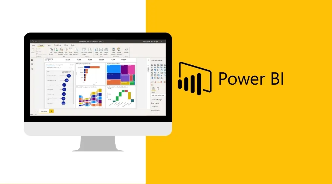
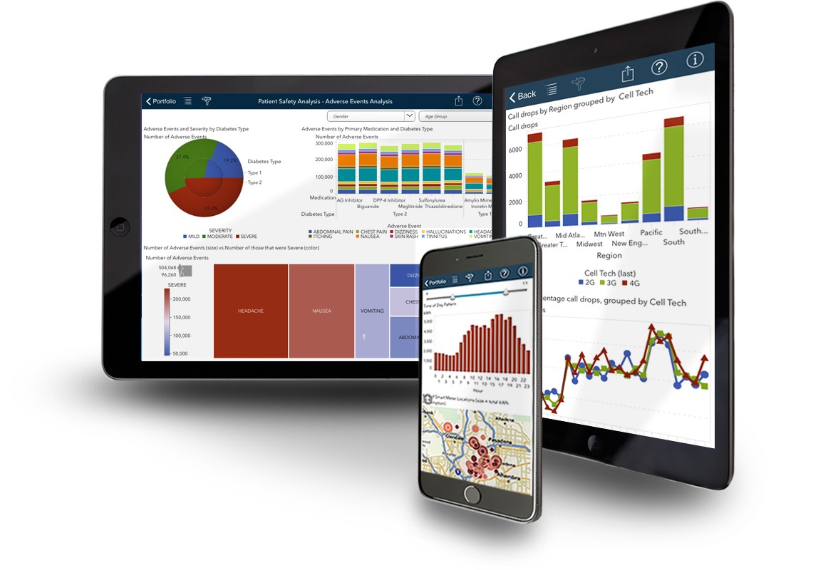
3. Choose the right visualizations
Visualizations are a key part of data visualization, and choosing the right visualizations can help you tell a more compelling story. Consider the story you’re trying to tell and choose visualizations that support that story. For example, if you’re trying to show how a particular variable changes over time, a line chart might be the best choice.