Contents
- What is a Brush Slicer?
- Introducing the Brush Slicer for Power BI by Datellers!
- How to import and use the Brush Slicer in Power BI
- How to use the Features in the Brush Slicer
- Formatting Options in the Brush Slicer
I. What is a Brush Slicer?
Brush: A brush is a tool in D3 for interactive data. Users can select parts of a visualization by dragging a rectangular brush over what they want to focus on. This makes it easier for users to dynamically explore and understand the information shown.
Slicer: A slicer is a visual element that lets users filter data in a report or dashboard. Users can interactively choose specific data values, which then filters the visuals on the report page. Slicers help users focus on specific parts of data for analysis and decision-making.
Brush Slicer: The brush slicer is a novel customized solution in Power BI. Unlike a standard date slicer, the brush slicer not only filters data but also visualizes the data, allowing the user to peek into the data available which makes filtration easier based on the underlying data.
II. Introducing the Brush Slicer for Power BI by Datellers!
The Brush Slicer, our latest addition to Power BI Custom Visuals, aims to revolutionize date slicing with an innovative approach. Unlike conventional date slicers, the Brush Slicer empowers users to effortlessly select specific date ranges by simply dragging over the desired time-period, all while examining trends and anomalies. This feature offers flexibility and customization for tailored date slicing in time series analysis.
We have packed the Brush Slicer with an array of features. From incorporating multiple Measures for comparisons like Actual vs Target, to enabling zoom functionality for a more detailed view of any date range,The Brush Slicer aims to elevate the users data analysis experience. Additionally, with the Snapping feature, seamlessly navigating between Years or Months becomes intuitive and efficient.
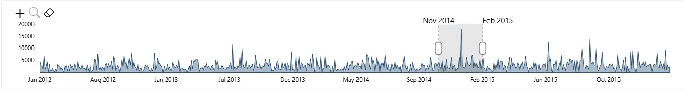
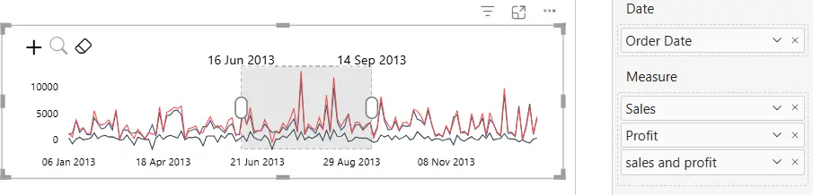
The example below shows the selection of a specific date range within the sales data.
The following is what the Brush Slicer offers its users:
- Visual Representation – Enables users to quickly preview the underlying data before slicing the entire report.
- Trend analysis – Able to quickly identify high and low points even before looking at the entire report.
- Intuitive slicing – Instead of using dropdowns or numbered ranges to filter dates, it empowers users to use an actual timeline making it more intuitive to select relevant date ranges & useful for users with varying levels of expertise.
- Brushing – Allows users to quickly change filtered data while maintaining the same duration, useful for filtering same duration repeatedly.
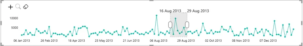
- Zooming – Enables zoom to a specific section in the data to identify smaller changes within the dataset.
- Comparative analysis – Allows the layering of metrics that aids in comparing quantitative values for the same date.
- Doubles as a Visual – It also enables the slicer to be used as a visual in itself with enhanced features, making it a more interactive bar/line/area chart.
III. How to use the Brush Slicer in Power BI?
- Save the Brush Slicer file (.pbiviz) locally, shared with you in the email.
- Here is a link to know how to import the visual in Power BI, once the file is saved – https://learn.microsoft.com/en-us/power-bi/developer/visuals/import-visual#import-a-visual-file-from-your-local-computer-into-power-bi
- Add the required data in the fields. There are four fields as follows:
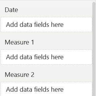
- Date – This field is used for showing the date range in the brush slicer.
- Measure – This field accepts one or more measures to be displayed as line/area charts. Adding multiple measures enables comparative analysis, such as Actual vs Target sales, within the same chart.
IV. How to use the Features in the Brush Slicer
You can use the following core features:
- Slicing – Slicing is the primary function of the Brush Slicer visual, designed to seamlessly filter data across other visuals in a user-friendly and visually intuitive manner. User has the flexibility to visually see the trends and simultaneously select any date range for filtering the remaining visuals.
- Zooming – This feature is used to zoom into smaller date ranges when there are many data points. User can enable this feature either by clicking the zoom icon in the top Left corner, or via the formatting pane.
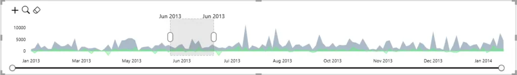
- Brushing – This feature is used to select the range of data which the user wants to filter. User can visually analyse trends and slice a range of data by using brushing techniques. Simply drag anywhere over the chart to select any date range, By default it selects entire date range, you can adjust range by dragging handles of the brush. User can further customise the brush colour, opacity, etc. from the formatting pane.
- Period Snapping – User can easily apply snapping by setting the brush to snap periods either Year wise, Month wise or Free. These convenient snapping options can be selected from the formatting pane.
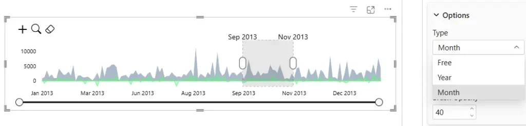
- Free: Free snapping enables the selection of any date range for slicing
- Year: Year snapping facilitates slicing by allowing brushing based on individual yearly date points.
- Month: Month snapping enables data slicing by permitting brushing based on individual monthly date points.
- Multiple Charts – User can choose between either a Line or Area Chart to view the data. The same can be selected for both measures 1 & 2 in any combination from the formatting pane.
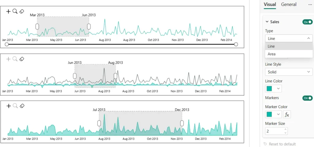
- Multiple Measures – User can incorporate two or more measures into the slicer visual, effectively transforming it into a multi-line chart. This feature facilitates comparisons, such as against a target, by enabling simultaneous visualization of multiple metrics within the same chart.
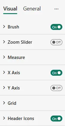
V. Formatting Options in Brush Slicer
The Brush Slicer comes with an array of customisations. Following is a list of the formatting options that can be applied to the Brush Slicer from Formatting pane:
1. Brush – Expanding ‘Brush’ gives the following formatting options:
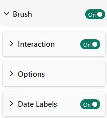
a. Interaction – Allows user to enable/disable brush interaction.
b. Options – Expanding this card will give following options:
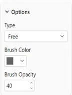
- Type – Allows setting the selection of the data range by Free/Year/Month (as per user’s discretion) from the dropdown.
- Brush Color – Allows changing the colour of the brush.
- Brush Opacity – Allows changing the opacity of the brush by either entering the percentage (of opacity) numerically or by adjusting the slider
c. Date Labels – Enable this to show date label for start and end:
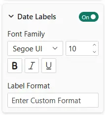
- Font style – allows to adjust font style, size for date labels.
- Label Format – Using this user can adjust date labels date format as needed.
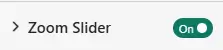
2. Zoom Slider – Enable or disable zoom slider using this toggle
3. Measure – Expanding ‘Measure ’ gives the following formatting options:
We can enable or disable every measure and format each measure separately
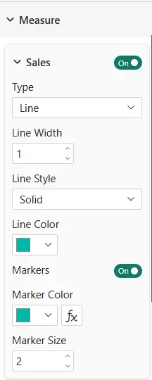
- Type – Allows setting the type of the Measure field, Allows choice between Line / Area chart in the dropdown.
- Line Width – Allows to adjust measures line width.
- Line Style – Allows to style the line with Dotted or dashed or solid options.
- Line Color – Allows changing the colour of Measure.
- Markers – Enable or disable markers on the line.
- Conditional Marker Color – Colour the markers or use conditional colour formatting for the markers.
- Marker Size – Allows toAdjust Marker Size using this.
4. X Axis – Expanding ‘X Axis’ allows the user to Show / Hide the X Axis at the bottom of the slicer. Also Allows to Style X-Axis with font size colour and family.
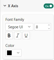
- Allows to style the font using Font family ,Size, Colour.
5. Y Axis – Expanding ‘Y Axis’ allows the user to Show / Hide the Y Axis to the left of the slicer. Also Allows to Style Y-Axis with font size colour and family.
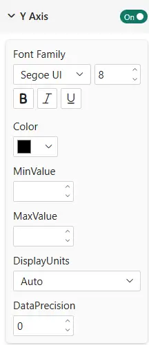
- MinValue – Allows to give minimum value to the Y-Axis.
- MaxValue – Allows to give maximum value to the Y-Axis.
- Display Units – Allows adjust display Units on the Y-Axis.
- Decimal Places – Allows to adjust number of Decimal Places.
6. Grid – Expanding ‘Grid ’ gives the following formatting options:
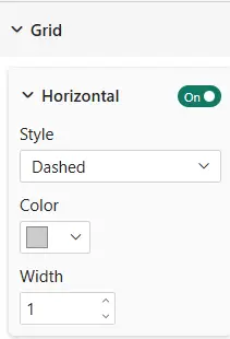
- Horizontal – Allows to Show Horizontal Grids in the visual.
- Style – Allow to Style lines with options like Dashed, Dotted, Solid.
- Colour –Allows to colour grid lines.
- Width – Allows to Adjust Width if the grid lines.
7. Icons – Expanding ‘Icons’ allows the user to Show / Hide the ‘zoom’ and ‘clear filter’ icons on the top right corner of the Brush Slicer