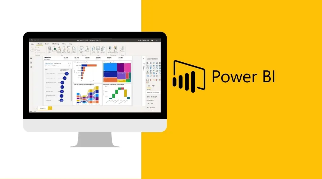
Power Bi dashboard is one of the most effective tools for data analysis and report creation. Microsoft’s robust analytics and reporting tool, Power BI, enables users to dig deeper into their data to get more information and, as a result, make more educated decisions. Users can readily view the metrics they need at a glance thanks to the way this data is presented in reports and dashboards. There are numerous capabilities in Power BI that can be used to enhance the visual appeal and readability of your reports while still providing all the information you require. In this post, we’ll give you some pointers that will make it easier for you to comprehend and produce stunning reports.
1. Think about your audience

The following should be taken into account when tailoring your dashboard’s appearance for your audience:
- What is the dashboard used for?
- What important metrics aid in decision-making?
- What cultural or educational presumptions might influence design decisions?
- What details are necessary for your audience to succeed?
Remember that the dashboard provides an overview and a centralised location to track the status of the data right now. The dashboard is built using underlying reports and datasets, which frequently have a lot of details. Don’t provide detail on the dashboard unless you absolutely need to, as your readers can drill into the reports from there.
2. Remove unnecessary information
Dashboards provide a centralised spot where you may easily view your critical data. As a result, it is advised to avoid scroll bars and to display all of the tiles on a single screen. Consider the information that must be visible when altering your dashboard, and remove the information that is not required. Users can effortlessly absorb and act on the information supplied in this way.
3. Utilize the appropriate data visualisation
- Visualizations must be clear and simple to “read” and comprehend.
- A straightforward graphic visualisation will do for some data and visualisations.
- Use caution when utilising visually appealing but difficult-to-comprehend materials, such as 3-D charts.
- Less than eight categories work best for pie charts.
Also read: Tips For Power BI Reporting
4. Put the most crucial details first
Typically, readers read from top to bottom. It begins with the most information in the upper left corner and gets progressively more detailed as you move along in the direction the audience is reading.
5. Pick a theme
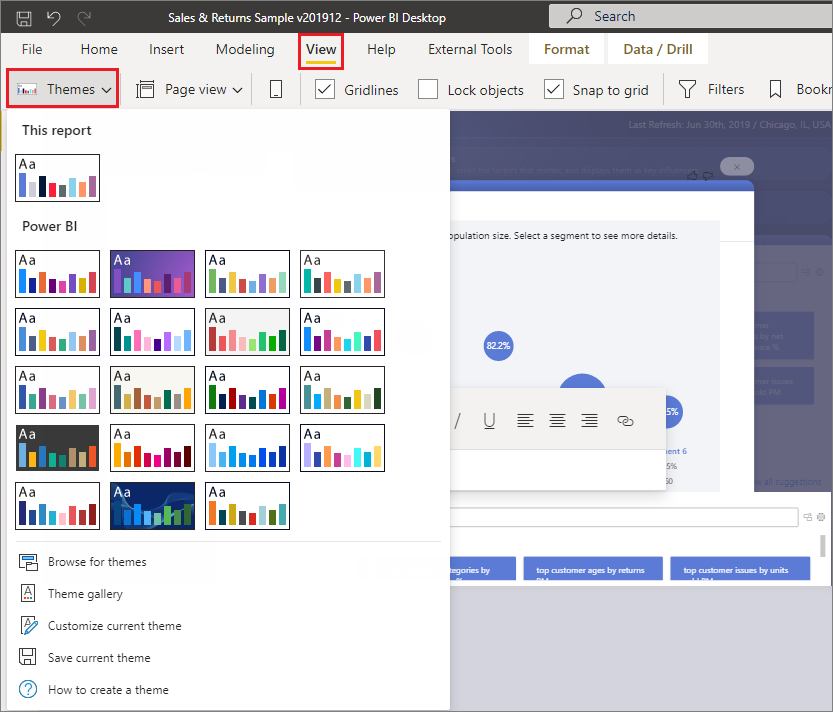
Only the desktop app can apply a theme, but once it is put up, it can be stored for later use. Colours, backgrounds, typefaces, visualisations, and the colour your filter window will appear in are all part of a theme. You will not only save time by not having to manually change each part, but your report will also be more coherent.
6. Keep it simple
We have found that it can be challenging to overcome this obstacle. People frequently attempt to use numerous functions at once, but they frequently fail because they overload a dashboard or just do it in an unintuitive manner.
When creating dashboards in Power BI, you must keep the end-users in mind. They may not be Power BI experts, and it’s unlikely that they will discover every tiny function and click on every slicer you’ve added to your dashboard. The experience of simply consuming the dashboard might be rather overwhelming for many of them.
7. Use tooltips
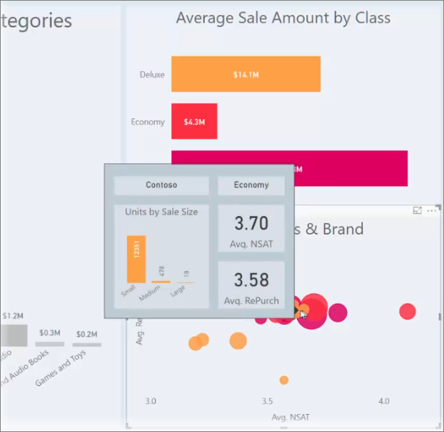
Regardless of how attractive your dashboard is, some of the data may be useless without context. With just one click, users may dive further into the information by using “tooltips,” which can instantly give the essential context. It is advised to keep the dashboard at a higher level and add tooltips to provide more detail without taking up more space.