Your Power BI report is useless without the appropriate visuals. Understanding when and how to use various visuals can help you exhibit insightful data effectively and save time on the creation of ineffective reports. You will discover
Your Power BI report is useless without the appropriate visuals. Understanding when and how to use various visuals can help you exhibit insightful data effectively and save time on the creation of ineffective reports. You will discover tips for using visuals in Power BI in this guide.
Tips For Power BI Reporting
- Use Appropriate Ratios
- Visualize the services you use
- Divide and conquer
- Tell stories with your data
- Utilize AI-powered visualisations to your advantage
1. Use Appropriate Ratios
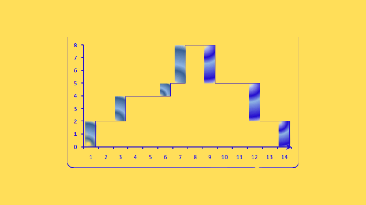
Avoid overstretching and projecting graphs at an angle of more than 45 degrees to avoid warping the graphics and overemphasising data changes.
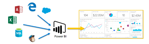
2. Visualize the services you use
For hundreds of data providers, apps, and services that include pre-set reports and visualisations, Power BI has hundreds of content packs, templates, and connections. You can use Power BI to visualise the data you have in those services—whether you use Xero for accounting, K2 Cloud to build business processes, Adobe Marketing Cloud, SAP HANA, Salesforce, MailChimp, Marketo, or Google Analytics—and to create reports against them and combine them in a unique dashboard.
The on-premises gateway can be configured so that you can use Power BI to explore data sets on your own servers. By doing so, you’ll be able to compare website visitors with sales or identify the campaigns that have attracted new clients.
3. Divide and conquer
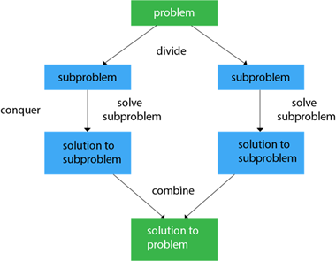
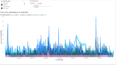
Even though it’s the most fundamental aspect of data visualisation, you might be startled by the sheer number of filtering options available in Power BI reports.
Basic report filters panel:
- Visual level filter –In order to have some background information, the visual level filter limits data to the set visual level (not visible in the chart) only used to filter data
- Page level filters –Filters at the page level that are applied to all page elements
- Report level filters –apply to all pages, which can be useful in situations where a user must navigate between sites to examine the data in the same filtering context but with a different view shown on each page. The filter remains selected when you choose it and turn to the following page, letting you view the data in the same context
4. Tell stories with your data
Charts are wonderful for numbers, but Power BI’s new Timeline Storyteller is the way to go if you want to explain information that changes over time. This tool allows you to arrange dates or times in a straight list, as well as in circles, spirals, grids, or other special shapes. Additionally, you have the option of displaying a chronological list, a sequence that demonstrates the duration of occurrences, or relative or logarithmic scales. Power BI will create a timeline from the data you choose to represent, scale, and arrange.
5. Utilize AI-powered visualisations to your advantage
Machine learning is used in a number of Power Bi’s interactive visualisations to find insights that would often require a data scientist. Key drivers make it easier to recognise and rank influencing elements, such as what causes things to go on backorder. The decomposition tree directs where to dive into the data when you undertake root cause analysis. Anomaly detection finds outliers and other anomalies in time series data, such as line charts, and offers explanations. In order to construct data tales for you, Smart Narratives can extract significant insights and trends and wrap them in automatically generated language.
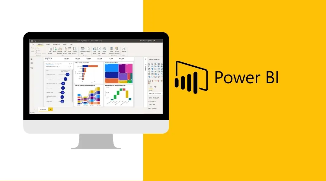
Power BI Report Example: Visuals in Action
Step 1: It determined the insights we needed to drive and matched them to the appropriate visual based on their data type.
Step 2: After deciding on our insights and how to properly visualise them, we placed and scaled them in accordance with the level of detail provided. We sought assistance with this approach from the “Positioning of Visuals” and “Sizing of Visuals” portions of this guide.
Step 3: To ensure proper alignment and structure when creating our report, use the Horizontal Canvas Grid from the Numerro Toolkit.
Step 4: We dragged and dropped our chosen graphic components onto the canvas grid, filled them with the appropriate text and data, and adjusted their sizes as needed. Keep in mind that we employ components because they automatically incorporate design best practices, so we don’t have to bother about continuously preparing our visuals and report.
Step 5: Added the finishing touches, which in this case included a theme from our library of 24 themes in both light and dark, titled “Theme 1 – Light.” Additionally, we added pertinent icons from our icon set to add more context, and we checked our visual tips checklist to make sure we were adhering to best practices.