Contents
- What is a Bar of Pie Chart?
- Introducing Bar of Pie for Power BI by Datellers!
- How to import and use Bar of Pie
- Core Features of Bar of Pie
- Formatting Options in Bar of Pie
1. What is a Bar of Pie Chart?
When users wish to show chunks of a small number of categories, a pie chart is an ideal visual. However, as the number of categories rises, the pie chart becomes quite difficult to read. Pie charts are also notorious for not being area friendly.
In such circumstances, the Bar of Pie visual may be extremely handy, since it allows you to shift the smaller slices of the pie to a separate stacked bar chart. A Pie of Pie chart works well too. However, Datellers decided to go ahead with developing the Bar of Pie instead of the Pie of Pie, because a Pie chart in itself isn’t as readable as a Bar Chart. We also decided to develop the Bar of Pie since it is a core visual available in Excel and Powerpoint, and yet it wasn’t available in Power BI. That is until now!
Following are a few advantages of using the Bar of Pie( Power BI) :
- A Bar of Pie chart is much more adaptable than a normal Pie chart, as you can shift the number of slices from the main Pie to the Bar
- A Bar of Pie chart is way more area-friendly than a normal Pie Chart
- A Bar of Pie chart also lets you create subgroupings, which is quite a challenge for a normal Pie Chart
2. Introducing Bar of Pie for Power BI by Datellers!
Seeing a requirement for a much-needed visual in the Market, Datellers has built our very own Bar of Pie visual for Free! We have made the visual as customizable, dynamic, and interactive as we can. We have also added a functionality where you can use the Bar of Pie as a subgrouping visual. Therefore, there are essentially two ways in which you can use the Bar of Pie.
i. Top N
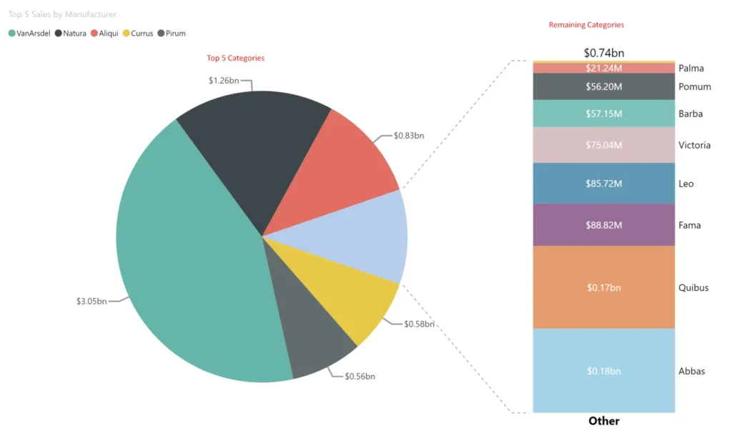
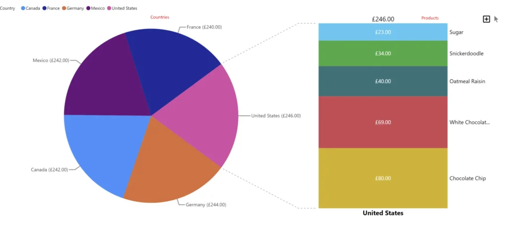
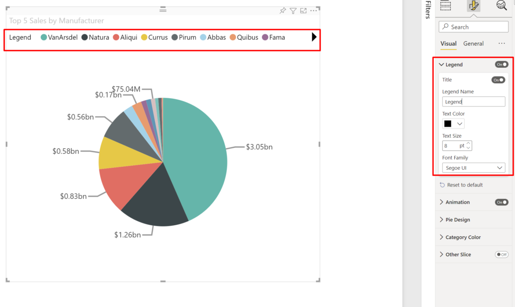
- Using the Top N functionality, one can select the Top Slices to show in the main Pie Chart on the left-hand side.
- The “Other” remaining elements are shown in a Stacked Power BI Bar Chart as a child chart located on the right-hand side.
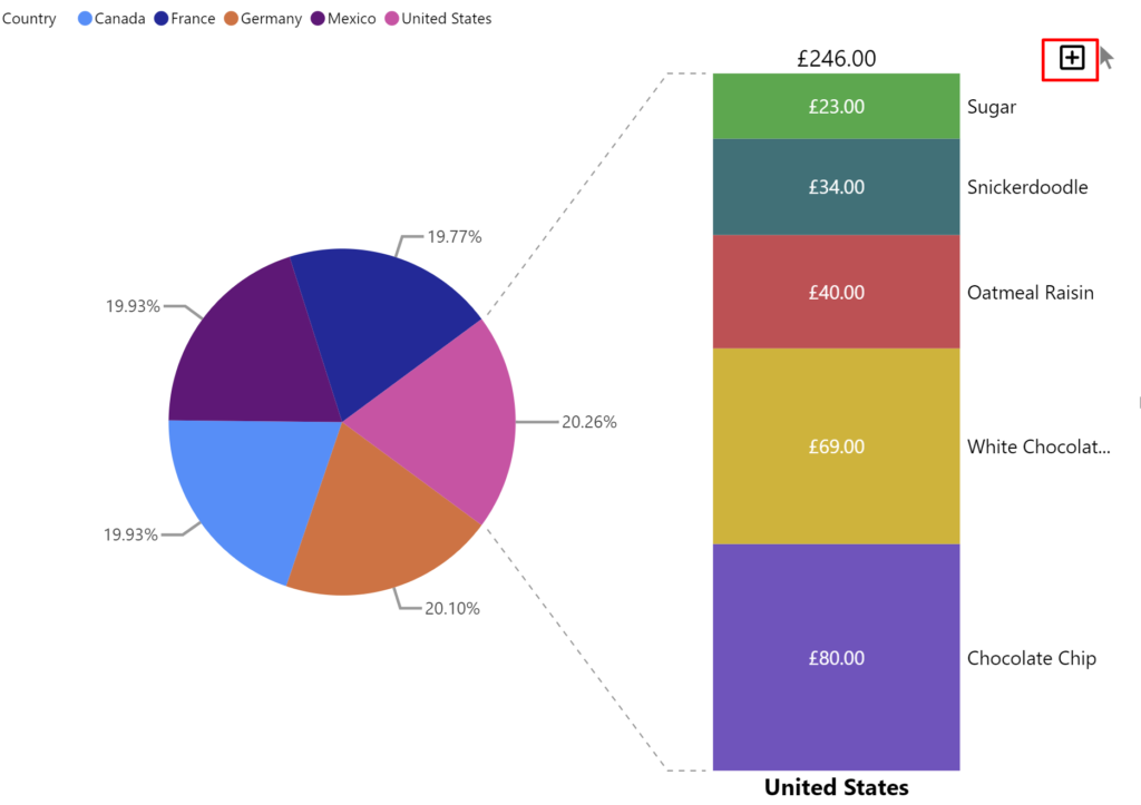
ii. Subgrouping
- Using the Subgrouping functionality, one can add a subcategory for each slice.
- The children for each slice can be seen at any point by just clicking on the slice.
- The visual also supports showing a default slice.
3. How to import and use Bar of Pie in Power BI?
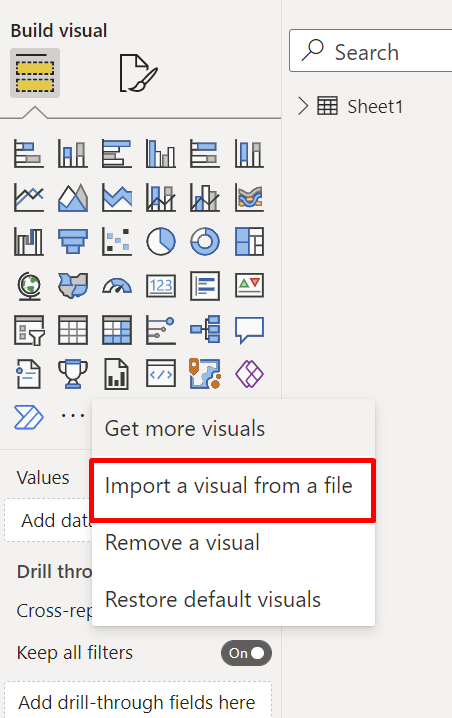
- Import the Bar of Pie Visual by clicking on the ellipses as shown in the picture.
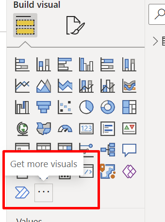
- Click on “Import Visual from File”.
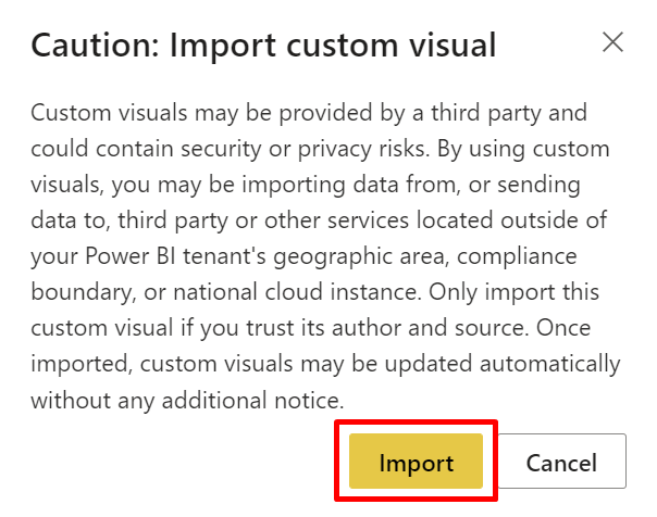
- Click on the Import button appearing on the dialogue box and select the .pbiviz file
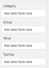
Add the required data in the data fields. There are 4 Fields as follows: Category, Group, Value, and Tooltips.
- Category – This field is used for showing the Slices in the Pie Chart. However, when a field is added in the Group field, this field is used for showing the Subgroup/Child data in the Stacked Bar
- Group (Optional) – This is an optional field that when used shows the Parent Slices in the Pie Chart.
Note: The Top N functionality cannot be used when this field is used. - Value – This field is used for determining the values for both the Bar and the Slices
- Tooltips (Optional) – A user can add any number of fields to display in the Tooltip
4. Core Features of Bar of Pie
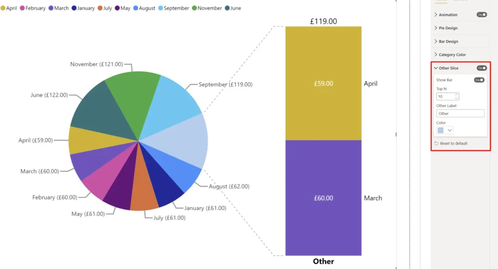
a. Top N:
Note: This feature only works when the Group field well is empty
The Top N feature lets a user select the Top N slices that should be shown in the main Pie Chart. The remaining features will be shown inside an “Other Slice” and in a Stacked Bar Chart.
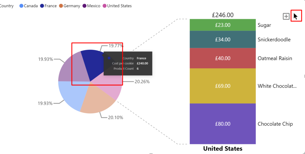
b. Expand and Cross-Filtering Mode:
Note: This feature only works on adding a field in the Group field well
- Expand: On selecting the Expand Mode, a user can select any slice to show a Stacked Bar containing it’s Child Data
- Cross-Filtering: On selecting the Cross-Filtering Mode, a user can select any slice to filter the rest of the visuals like an OOB Pie Chart
c. Tooltips: Tooltips are an effective method to provide extra context and depth to data points on a graph. The Bar of Pie supports the default Tooltip with N values, as well as Report Page Tooltips. The formatting option can be found inside the General Tab.
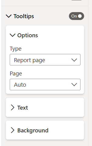
d. Legend: Legends have their own well-located place within the visualizations pane’s fields section in Power BI.
- You can Expand the legend so that you can add an optional Legend Name, Text Color, and Text Size, as well as select the Font Family as shown in the figure.
5. Formatting Options in Bar of Pie
Following is a list of format settings that can be applied to the Bar of Pie:
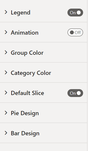
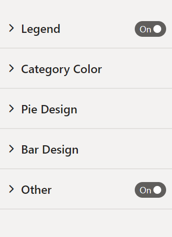
- Legend – Show/Hide the Legend Pane on top of the visual
- Font Family – Setting to select the Font Family of the Legend. The Font can also be set as Bold, Italic or Underline.
- Font Size – Setting to change the Font Size of the Legend
- Font Color – Setting to change the Font Color of the Legend
- Title – Show/Hide an optional Title
- Animation – Enable or Disable visual animation
Note: This formatting option is only visible with Subgrouping- Duration – Set the animation duration in milliseconds
- Group Color – Format Setting to change the color of each Group Slice
Note: This formatting option is only visible with Subgrouping - Category Color – Format Setting to change the color of each Subgroup/Bar when Subgrouping is used, or else Format Setting to change the color of each Slice when Subgrouping is not used
- Default Pie – Expand/Collapse a Default Slice
Note: This formatting option is only visible with Subgrouping- Default Type – Following are the options available
- Min Slice – Slice with the least value
- Max Slice – Slice with the highest value
- First Slice – First Slice based on sorting applied to the visual
- Last Slice – Last Slice based on sorting applied to the visual
- Custom – Type a custom slice label in an input box
- Default Type – Following are the options available
- Pie Design – Format Setting to customize the Pie Chart
- Text
- Font Family – Setting to change the Font Family of the Pie Chart Labels. The Font can be set as Bold, Italic or Underline.
- Font Size – Setting to change the Font Size of the Legend
- Inside Font Color – Setting to change the Text Color of the Labels inside the Pie Chart
- Outside Font Color – Setting to change the Text Color of the Labels outside the Pie Chart
- Display Units – Setting to change the Display Unit of the Pie Chart Labels (Auto, None, Thousands, Millions, Billions, Trillions)
- Decimal Places – Setting to change the number of decimals
- Options
- Padding – Apply Padding to the entire Pie Chart
- Position – Display Labels either inside/outside the Pie Chart
- Label Contents – Setting to Format of the Data Labels.
- Group – Display only Slice Name
- Data Value – Display only Slice Value
- Percent of total – Display only Slice Percentage
- Group, data value – Display Slice Name and Value
- Group, percent of total – Display Slice Name and Percentage
- Data Value, percent of total – Display Slice Value and Percentage
- Text
- Bar Design – Format Setting to customize the Stacked Bar
- Text
- Font Family – Setting to change the Font Family of the Labels inside the Bar Chart. The Font can also be set as Bold, Italic or Underline
- Font Size – Setting to change the Font Size of the Labels inside the Bar
- Font Color – Setting to change the Color of the Labels inside the Bar
- Display Units – Setting to change the Display Unit of all Bar Chart Labels (Auto, None, Thousands, Millions, Billions, Trillions)
- Value Decimal Places – Setting to change the number of decimals
- Labels
- Bar Label Area – Set the percentage of area that the Labels can consume
- Font Family – Setting to change the Font Family of the Labels outside the Bar Chart. The Font can also be set as Bold, Italic or Underline
- Font Size – Setting to change the Font Size of the Labels outside the Bar
- Font Color – Setting to change the Color of the Labels outside the Bar
- Title
- Font Family – Setting to change the Font Family of the Title below the Bar Chart. The Font can also be set as Bold, Italic or Underline
- Font Size – Setting to change the Font Size of the Title below the Bar
- Font Color – Setting to change the Color of the Title below the Bar
- Total
- Font Family – Setting to change the Font Family of the Total above the Bar Chart. The Font can also be set as Bold, Italic or Underline
- Font Size – Setting to change the Font Size of the Total above the Bar
- Font Color – Setting to change the Color of the Total above the Bar
- Options
- Bar Area – Set the percentage of area that the Bar can consume
- Value Format – Setting to Format of the Value Labels inside the Bar
- Group – Display only Stack Name
- Data Value – Display only Stack Value
- Percent of total – Display only Stack Percentage
- Group, data value – Display Stack Name and Value
- Group, percent of total – Display Stack Name and Percentage
- Data Value, percent of total – Display Stack Value and Percentage
- Text
- Other Slice – Format Setting to Show only Top N Slices in Main Pie
Note: This formatting option is only visible when Subgrouping is not used- Show Bar – Show/Hide the Stacked Bar
- Top N – Select the Top Slices to be shown in the Pie. The remaining will be displayed in the Bar
- Other Label – Rename the Other Label if needed
- Color – Set the color of the Other Slice
You can download the Bar of Pie Chart for free from Microsoft AppSource! Please do reach out at [email protected] if you have any queries.