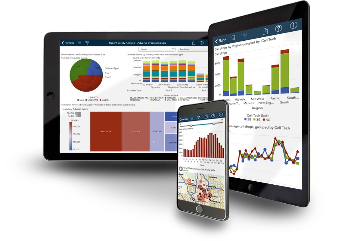
One of the key elements to improving a company’s success is data analytics and data visualisation. The firm may review, spot data patterns, and gain insightful information to alter its business by visualising a sizable volume of data on a single screen. Many tools on the market assist businesses in using charts and visuals to present complex data in an easier format.
Power BI offers a simple method for producing stunning, coordinated reports from unstructured data. With the help of this business analytics service, you can work with massive amounts of data and do calculations more quickly. It enables you to make knowledgeable business decisions without the assistance of DB administrators or technical people. We’ll now go over the several sorts of charts that Power BI Desktop and the Power BI service frequently employ.
Different types of Power BI Charts
- Column and Bar Chart
- Line Charts
- Doughnut Chart
- Area Charts
- Pie Chart
- Cards
- Combination Chart
- Combo Charts
- Funnel Chart
- Decomposition Tree
1. Column and Bar Chart

Among the most popular techniques for data, visualisation is column and bar charts. Rectangular bars that are proportional to the data values utilised in one or more categories are used in these illustrations. Column charts, which are frequently used by Power BI developers across several categories to display trends, differences, highs, and lows, also distinguish data by grouping it into a few clusters.
2. Line Charts
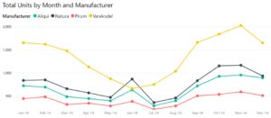
One of the most popular Power BI Charts is the line chart. To keep all the points in a series, it shows the data values and connects the data points with a line. These are frequently used to show data across time, including trends in the data as well as durations of days, months, and years. Each dot shown on the line chart represents a different data value and draws a straight line from one data point to the next.
3. Doughnut Chart
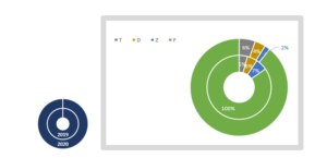
You can see the entire data preposition in two sections using the doughnut chart. It is utilised to show several classifications. Since they cannot depict changes using bar graphs or line charts, these graphs are different from bar and line graphs.
Also read Bar of Pie – A Power BI Custom Visual By Datellers!
4. Area Charts
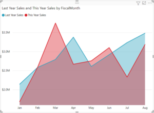
The area between the line plotted and the axis is filled in on an area chart, identical to how it is on a line chart. This Power BI Chart represents the overall value along the trend line or the size of the change in the data.
Multiple areas (stacked) may be present in an area chart, and the overlap between the two graphs shows the change. Consider comparing the sales from the current year to the prior one.
5. Pie Chart
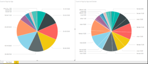
The visual representation of how various numbers add up to a total is a pie chart. Unlike doughnut charts, it features a core that is filled with many types of data. These fragments, referred to as slices, are used to compare one dimension to the other members of the same dimension. Pie charts should include five to six slices. Otherwise, it affects reading in fast-paced settings like business, media, and education.
6. Cards
Power BI includes cards with many rows and just one number that is intended to present a specific piece of information. This can be a total number, an average number, a sum, or a total number calculated using specific methods.
A single data that customers can readily track is displayed on a single number card, such as the total number of orders filled today, the market share as a whole, etc. On the dashboards, these cards are arranged as a tile.
7. Combination Chart
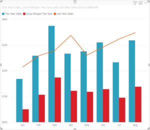
A-line and bars chart combo, as the name implies, facilitates data comparison. It has more than one Y-axis since it compares several measurements and values in a single picture. By a second dimension that subcategorizes the first dimension, we can create a stacked combination chart similar to a stacked bar chart.
8. Combo Charts
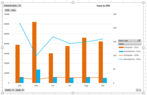
A unique Power BI chart called the Combo Chart combines a line chart and a column chart. Users may simply compare data points and assess them while using both Power BI Charts.
9. Funnel Chart
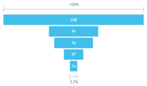
Funnels, for instance, show us the many steps of the sales process. Starting with a lead, it descends until it converts them into a customer. The flow as you progress down the funnel is depicted in these charts by breaking it down into successive components. It demonstrates the flow of data from one stage to the next. The funnel chart treats the full data set as 100%, with numerical data proposals standing in for each phase.
10. Decomposition Tree
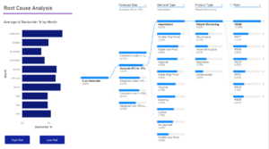
One of the distinctive and sophisticated Power BI Charts that makes it simple for users to visualise the data across various dimensions is the decomposition tree. One may quickly go down into the data and obtain interactive insights by using this Power BI Chart type.
Moreover, The Decomposition tree in Power BI has artificial intelligence that makes it easier for users to understand data and allows them to drill down to the next dimension of the data based on particular criteria. Users that need to undertake ad-hoc data analysis can employ decomposition trees.