Over 2.5 quintillion bytes of data are produced every single day, and 90% of all data has been produced in the last two years, claims DOMO. Making sense of this enormous volume of data is a challenging undertaking.
Therefore, to extract value from data, the vast majority of enterprises use business intelligence visualization tools. One of the best visualization tools for handling data in clear patterns and making observations is Power BI. As part of the data science process, which also involves data visualization, data proliferation can be controlled. You may efficiently manage a large volume of data in 2022 by utilizing several Power BI graphics or chart styles.

What Is Data Visualization?
The graphic display of information and data is known as data visualization. Data visualization tools offer an easy approach to observing and analyzing trends, outliers, and patterns in data by utilizing visual elements like charts, graphs, and maps.
To analyze vast volumes of data and make data-driven decisions, data visualization tools and technologies are crucial in the world of big data.
Also read: Top 5 Free Power BI Custom Visuals in Microsoft AppSource 2022
How do Power BI Visuals work?
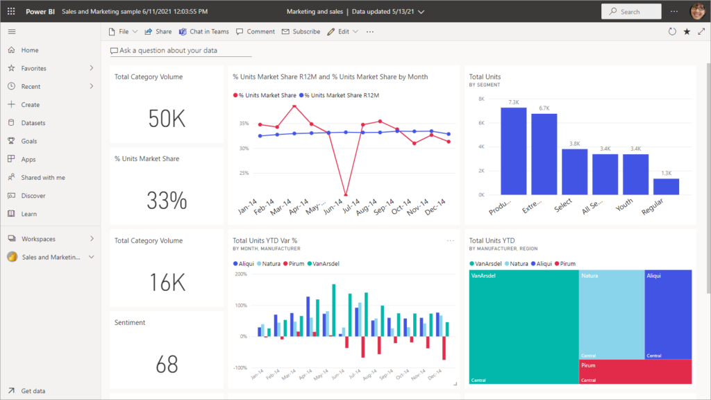
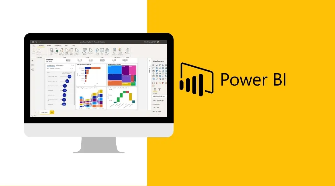
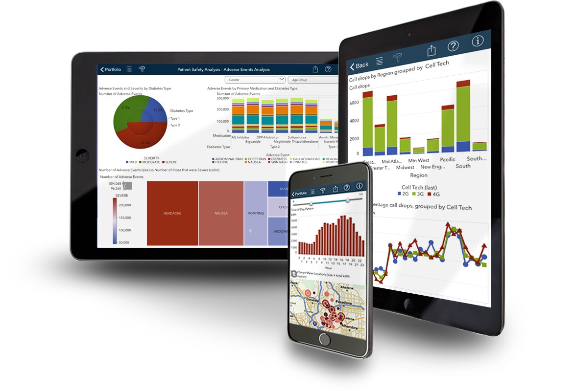
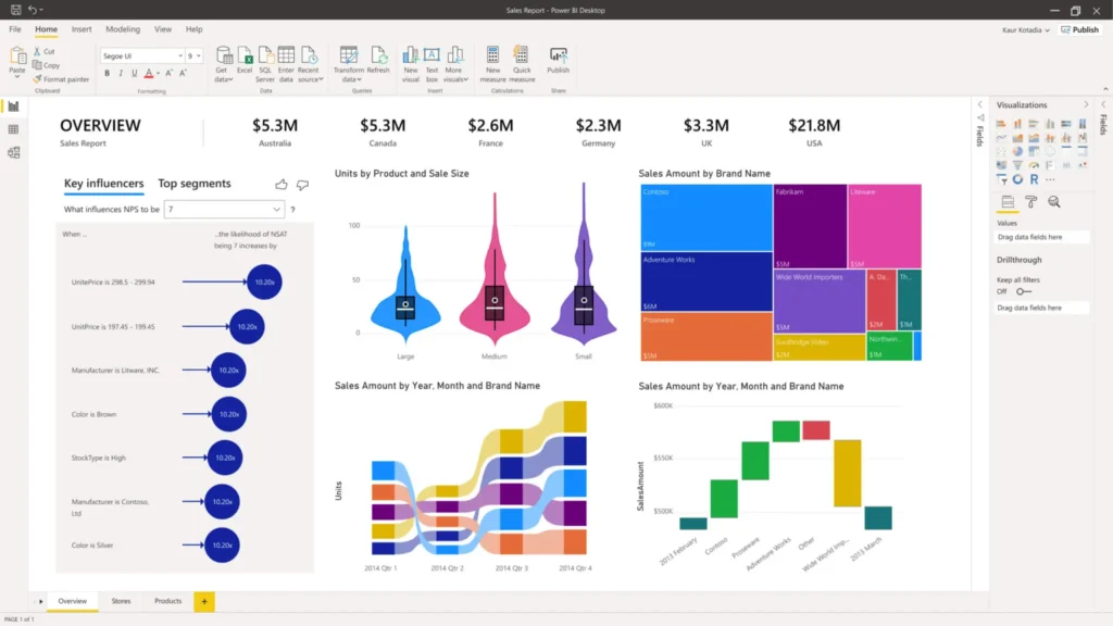
The most crucial component of any Power BI report, visuals are simply a visual (image) representation of your data and are in charge of giving it life.
By making your data story more visually appealing, you can make it simpler for your consumers to recognize and comprehend the trends in your data.
Microsoft AppSource is a marketplace for enterprise software, including Office 365, Dynamics 365, Power BI, and individual Azure web apps. With AppSource, adding purpose-driven extensions to Microsoft business software is as easy as downloading an app for a phone.
How to use a Power BI Visualization?
Visualizations are the fundamental components of any Business Intelligence application and are used to properly present your data. Power BI has a variety of default data visualization elements, such as straightforward bar charts, pie charts, and maps, as well as more intricate models like waterfalls, funnels, gauges, and many other elements. There are two approaches to making Power BI visuals:
Step1: You can simply drag and drop the fields from the right sidebar to the axis when using the first technique. You can add as many fields to the axis as necessary to meet your company’s needs.
Step2: You can also click and drag your visualization in Power BI to move it on the reporting canvas. From the Visualization window, you can easily change between various charts and visualizations. Your chosen fields are converted by Power BI to the new visual type as closely as feasible.
Power BI – Individual Visualizations Examples
Below are a few examples of the visuals available outside of the OOB Power BI Suite:
- Aster Plot
- Bullet Charts
- Calendar Charts
- Chiclet Slicer
- Chord
- Dot plot
- Histogram
- Radar Chart
- Stream Graph
- Sunburst
- Synoptic Panel
- Tornado
- Hexbin Scatter Plot
- Enhanced Scatter Plot
Importance of Visualization in Power BI
Apart from the plethora of visuals already available, Power BI gives users the flexibility to design unique graphics intended solely for organizational usage. To illustrate data patterns and information that is essential to the organization, developers within the company might generate specialized visualizations.
To give business users the ability to see their data in a way that best suits the business, developers use the custom visuals SDK to generate custom visuals. The custom visuals files can be imported by report authors and used as normal Power BI visuals in their reports.
A JavaScript package called D3. js is used to modify documents based on data. It produces visual representations of data using HTML, CSS, and SVG that can be viewed on any current browser. Additionally, it has some fantastic animation and interactivity elements.
Conclusion
Custom graphics and Power BI are two highly intriguing technologies. Because they are constantly evolving, we love them and put up with their shortcomings. We will convert all of our visuals to the new API over the course of the coming weeks; just subscribe here to receive updates or check back soon!
We talked about the various Power BI visualization kinds as well as how to build one. On this Microsoft platform, there are many additional Power BI Visuals List and Chart Types accessible. We trust that we provided thorough instructions on when and how to apply the visualizations in accordance with your business requirements.