Power BI is the most talked about analytics tool in the technology space right now. Custom visual is a new feature which was been released in Microsoft’s Power BI tool. There are dozens of Power BI custom visuals that can be used in Power BI to visualize your data. It allows users to create their own visuals using the same development language and tooling as the Power BI team. This is a list of the top 5 Power BI custom visuals that you can use to make your dashboards look great and communicate your data better.
Top 5 Free Power BI Custom Visuals in Microsoft AppSource 2022
- Infographic Designer
- Chiclet Slicer
- Play Axis
- Word Cloud
- Deneb
1. Infographic Designer
You may precisely modify the shapes, colours, and arrangement of lists, bar charts, and column charts with the infographic designer’s custom visual, allowing you to show information in a way that best conveys the meaning of your data. This precise layout control allows you to create both straightforward pictograms and intricate, highly customised visuals when combined with the option to insert unique shapes and pictures that can be connected to data.
To transform data into information, it offers a full range of layout and graphic modification choices. Additionally, you have the option of tiling the image to indicate an amount or showing a single image with a colour fill to represent a percentage of the total value. The best part is that you may alter the design of the chart with little adjustments thanks to the ability to add various shape layers and text elements that can all be tied to data.
Pros
- This visual’s representation of the data makes it easy to tell engrossing data stories and use your imagination.
- Nearly all of the skills required for design and customisation are present in it.
- It is incredibly cool and simple to use.
Also read: Warning and Error Messages in Power BI Custom Visuals
2. Chiclet Slicer
The excellent slicer control offered in Excel since 2010 served as a model for the Chiclet Slicer, which offers significantly more customizability. Chiclet is a button-based slicer that can be stacked horizontally for optimal real estate utilisation or in a matrix for an extremely compact shape. Cross highlighting is supported by a chiclet slicer as well. Not only that, but they may also include photos! This graphic is open source.
Also read: Downloading and Importing Custom Visuals from Microsoft AppSource
Pros
- The app is extremely practical and visual.
- This is a good choice when some attractive buttons are required.
- Utilizing the app is quite simple.
3. Play Axis
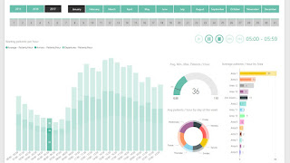
It’s suitable for usage on wall displays since it allows you to view your reports without clicking each time you want to adjust the values of a filter. Since you can click “play” and concentrate only on how data is changing, it is particularly excellent when you want to detect trends or hunt for patterns in your data.
Pros:
- This presents a very professional image.
- A really nice tool to display the evolution over many years is Play Axis.
4. Word Cloud
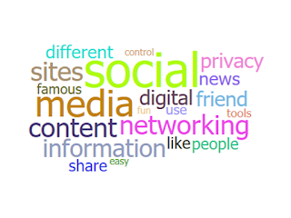
Word frequency and value are displayed visually in word clouds. Utilize it to gain quick insight into the key terms in your data. The dynamic Word Cloud feature in Power BI eliminates the need to laboriously sift through voluminous amounts of text to identify the terms that are widespread or noteworthy. Simply see them as a Word Cloud to get the overall picture right away.
Then, use Power BI’s interactivity to slice and dice the data further to identify the underlying trends. You have the option of word-breaking the text to find frequent words or leaving word-breaking off to project a measure as a text value.
Pros
- Additionally, stop words can be enabled to exclude cliches from the word cloud and reduce clutter.
- You can use this graphic in a variety of inventive ways by enabling rotation and experimenting with the permitted angles.
- This app created a visually appealing graphic for a report on qualitative research.
5. Deneb

Deneb is a custom visual for Microsoft Power BI that enables developers to design unique data visualisations without needing to learn web development using the declarative JSON syntax of the Vega or Vega-Lite languages. You can significantly increase your Power BI visual alternatives by getting to know the Vega-Lite and Vega languages and developing your “visual thinking” skills.
The website also covers Power-BI-specific topics, such as how to design your graphics to take advantage of prospective visual canvas integration features like tooltips, context menus, and cross-filtering other graphics.
Pros
- Visuals can be created that are incredibly personalised.
- A game-changing tool that allows users to create personalised visuals using the vega-lite visual programming language and with rudimentary tool expertise.
- Deneb allows report authors total creative flexibility and puts Power BI considerably closer to Tableau’s visualisation capabilities.