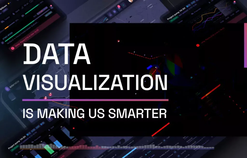
Data visualization is becoming increasingly essential for any business. It provides a more concrete representation of statistics and other complex facts, making it simpler to comprehend. In order to advance industries by improving narratives and making otherwise difficult-to-understand concepts more understandable, a deeper and clearer knowledge of data is an essential component of research and decision-making. Read the article below to know What are the biggest challenges in Data visualization today?
What is Big Data Visualization?
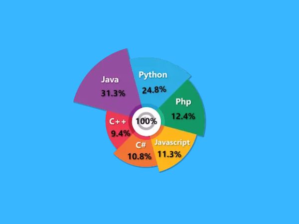
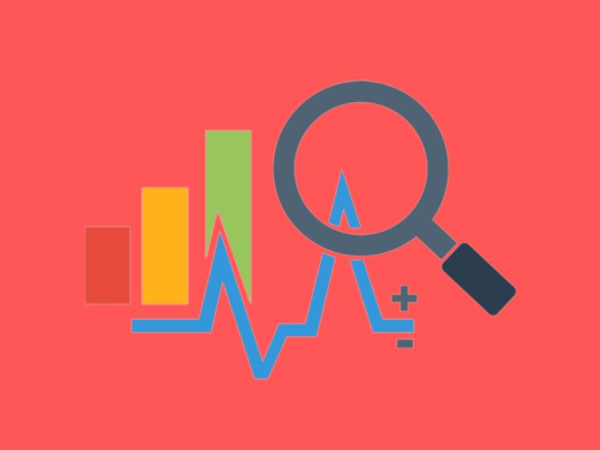
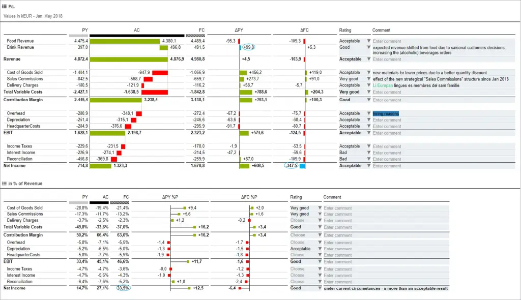
Graphs, bars, and charts are frequently used in business to illustrate the relationships between data. They can also make use of different colours, texts, and symbols. The primary problem with this design, however, is that it needs to be able to display vast data or data that contains extremely large numbers better. Data visualisation uses more dynamic, graphical graphics, including personalisation and animation, to display numbers and create connections between various forms of information.
Big Data Visualization is the process of using more cutting-edge visualisation techniques to demonstrate the connections between different data sets. Visualization techniques that go beyond pie, bar, and other charts include applications that display real-time changes and more illustrative visuals. These illustrations present the information in a more aesthetically pleasing way.
What are the biggest challenges in Data visualization today?
- Data Can Be Simplified Too Much
- Insufficient literacy in data visualisation
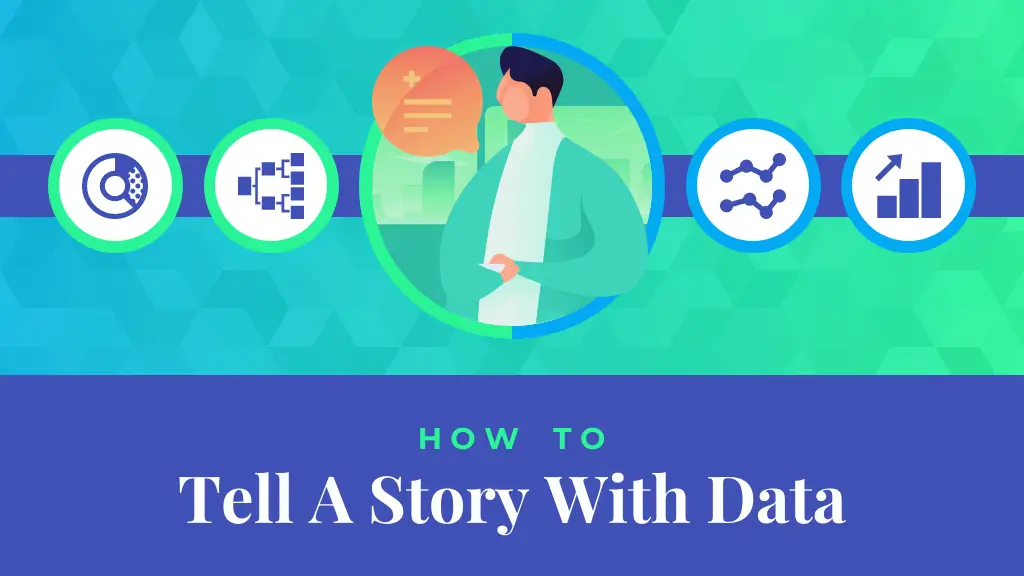
- Tell Meaningful Stories Through Visualizing Data
- Unconscious bias
1. Data Can Be Simplified Too Much
To make vast volumes of information easier for viewers to interpret, visualisations condense them into simple graphs, scatter plots, and other basic images. Because of this, some professionals have the propensity to oversimplify. By putting too much emphasis on aesthetics, they could omit important details. As a result, the images may cause viewers to draw incorrect inferences and conclusions. In the end, this may result in poor decisions that hurt enterprises. Utilizing the assistance of data analytics consulting firms lowers the possibility of oversimplification and can guarantee an accurate representation of facts.
Also read: What are different types of Data Analytics
2. Insufficient literacy in data visualisation

Lack of sufficient data visualisation knowledge might cause more harm than good. The audience is first misled, or worse, confused. Furthermore, a badly designed data visualisation indicates wasted time and effort, which slows down the decision-making process in projects with tight deadlines. Additionally, some data visualisation tools fail to convey the information they are designed to. As a result, viewers frequently comprehend whatever is presented to them, and occasionally they comprehend more than the presenters do. Such outcomes frequently occur for the following reasons:
- using an incorrect chart type
- Using a 3D graphic incorrectly
- presentation of false or incomplete data
- scale differences between the data conveyed
- a graph that seems cluttered
3. Tell Meaningful Stories Through Visualizing Data
Even though it continues to be a valuable tool for thousands of firms in numerous industries, data visualisation faces its own set of difficulties. There are still problems that need to be solved, including input errors, oversimplification, and a growing dependency on this form of communication. Nevertheless, the effects of this method of information sharing are evident and will only grow as technology advances.
4. Unconscious bias
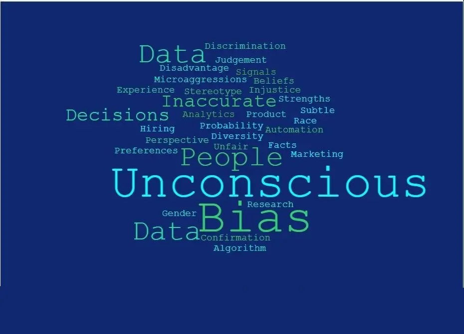
No matter how tiny the bias is, those in charge of maintaining the data visualisations frequently introduce it. The preference may take the form of sampling, algorithms, cognitive processes, or intergroup interactions. The most prevalent bias in data visualisation, nevertheless, is cognitive bias, which results from individual interpretations and interceptions of the data.
Therefore, be aware of all potential forms of bias that may arise due to your personal perceptions whenever you or a team is working with data to build infographics and visualisations. To recognise all those essential components and aspects that influence your understanding and interpretation of the facts, it is also imperative that you become familiar with various sorts of bias. This way, bias—no matter how huge or small—can be avoided.