You have undoubtedly been instinctively visualising a series of positive and negative data that leads to the final net value utilising the waterfall chart concept. But did you know that there are numerous ways to describe data using the same concept? This article will discuss how to configure each of the 6 options that the xViz Waterfall chart offers.
What is a waterfall chart?
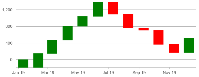
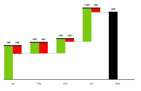
Each element that contributes to the final value is shown individually in the Power BI basic waterfall chart. The waterfall chart gets its name from the fact that most waterfalls don’t have exactly uniform water flow. We have a baseline of zero and a starting bar that symbolises the initial value. The transitional values, which reflect both positive and negative changes to that initial value, are represented by a few bars that appear to float in space. These may be based on time or category.
1. Use colors to tell a story
Use distinct colours for positive and negative values, and ideally a third colour for the beginning and finishing totals.
The color scheme you choose will mostly depend on the data story you want to tell. Growth is a positive factor when examining profitability. However, when considering expenses, that’s not truly the case. As with any report, it’s crucial to take into account the context of the data your Power BI waterfall chart is presenting.
2. Variance Analysis
Additionally, the variance between two KPIs within a category can be examined using the xViz Waterfall visualisation, negating the need for additional variance measures in the model.
Consider a manufacturing business where investors contribute capital to cover startup costs and sales amount is what brings in money. We must determine the difference between Capital and Sales for each quarter in order to illustrate the gain or loss for that quarter.
3. Choose Sub-Total Mode
Now that your categories are sorted in order, you may have noticed that some are missing values. If you select the Sub-Total Mode option, Waterfall PRO will separately compute and show them.
The waterfall chart will calculate these values dynamically rather than ignoring them if you encounter a circumstance where you have specified the sequence but some fields are lacking their values. There are four choices available. They are located under Column Settings’ Format tab.
4. Intermediate Sum
We might want to display the sum of the values in phases for particular use situations. For instance, having the intermediate sums for each quarter is helpful when examining sales on a monthly level.
Add Month to the Category data field and Sales to the Value data field to see custom intermediate sums. Click on the Advanced Editor icon in the visual canvas to turn on Intermediate Sum. Choose “Sum” for a basic sum or “Running Sum” for a cumulative sum when choosing the kind of aggregation.
5. Cross-chart filtering
With the Waterfall PRO custom visual for Power BI, cross-chart filtering is a simple process. You can make a waterfall chart that functions as a sort of report index that your audience can use to filter the remaining portions of the report. This would be excellent in conjunction with our Combo PRO and TimeSeries PRO custom graphics for Power BI, to give you some examples.
The Drill Down Waterfall PRO custom visual is an excellent option for chart analysis at the executive level where decisions need to be made quickly because these interactions and drill downs are also functional on touch input devices. Makes sense if you’re creating a waterfall chart for profit and loss.
6. Running Breakdown
Running Breakdown is similar to Simple Breakdown in that we view a KPI by a Category, with the Breakdown column providing more specificity. Contrary to the Simple Breakdown, breakdown bars display absolute values rather than variance. As a result, the Category’s bars in the waterfall image display cumulative values.