Interactive data visualization for business intelligence and dashboards is a powerful tool that helps businesses gain insights and make data-driven decisions. It involves using graphical representations of data that can be interacted with by users to explore and analyze data in real time. This type of visualization allows for creation of dynamic and informative dashboards that can be used to monitor key performance indicators (KPIs) and identify trends and patterns in data.

Interactive data visualization enables users to quickly and easily filter, sort, and drill down into data to better understand business performance. It can also be used to create predictive models that help businesses forecast future trends and make informed decisions based on data.
Tools for creating interactive data visualization
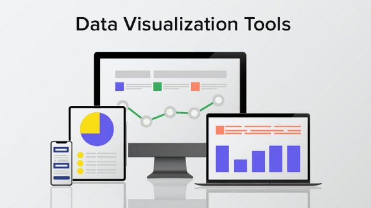
There are several tools available for creating interactive data visualizations for business intelligence and dashboards. Here are some of the most popular ones:
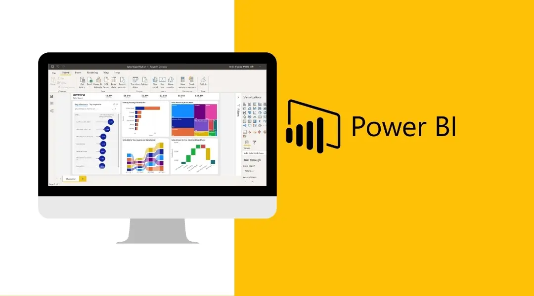
- Power BI: Power BI is a data visualization tool from Microsoft that allows users to create interactive reports and dashboards. It offers a range of features, including data blending, data modelling and real-time collaboration. It also provides ease of use with drag & drop functionality.
- Tableau: Tableau is another powerful business intelligence and analytics tool that allows the creation of interactive data visualizations, dashboards, and reports. It offers similar features as Power BI, including data preparation, data blending, and real-time collaboration.
- QlikView: QlikView is a business intelligence and data visualization tool that allows users to create interactive dashboards and reports. It offers a range of features, including data exploration, data analysis, and data visualization options.
- Google Data Studio: Google Data Studio is a free data visualization tool that allows users to create interactive dashboards and reports. It offers a range of features, including data blending, data visualization options, and real-time collaboration.
- Domo: Domo is a cloud-based business intelligence and data visualization tool that allows users to create interactive dashboards and reports. It offers a range of features, including data preparation, data modelling, and real-time collaboration.
Also read: The Importance of storytelling in data visualization
Benefits of using interactive data visualization
There are several benefits of using interactive data visualization:
1. Increased engagement
Interactive data visualization allows the user to engage with the data rather than passively absorb it. Active engagement helps in a better understanding of the data
2. Better insights
Interactive data visualization enables users to uncover hidden patterns and trends in the data. By exploring the data in different ways and scenarios, users can gain a deeper and better understanding of the information and the relationships between different data points
3. Faster decision-making
Interactive data visualization allows users to quickly identify and analyze trends, patterns, and anomalies in the data. This can help organizations make faster and more informed decisions.
4. Improves collaboration
Interactive data visualization tools can facilitate collaboration among teams by providing a common platform for data exploration and visualization. This can improve communication and collaboration among team members.
5. Provides flexibility
Interactive data visualization tools are highly flexible and can be customized to meet specific needs. Users can choose different visualization techniques, colours, and layouts to suit their needs and preferences.
Conclusion
In conclusion, interactive data visualization is a powerful tool for business intelligence and dashboards. It allows users to explore data and gain insights through a range of visualizations that are interactive and dynamic. Interactive data visualization can increase engagement, enable better insights, and lead to faster decision-making.
When creating interactive data visualizations for business intelligence and dashboards, it’s important to keep it simple, use appropriate charts, allow for interactivity, and use colour and design effectively. Overall, interactive data visualization tools can improve data analysis and decision making by making data more accessible and easier to understand.