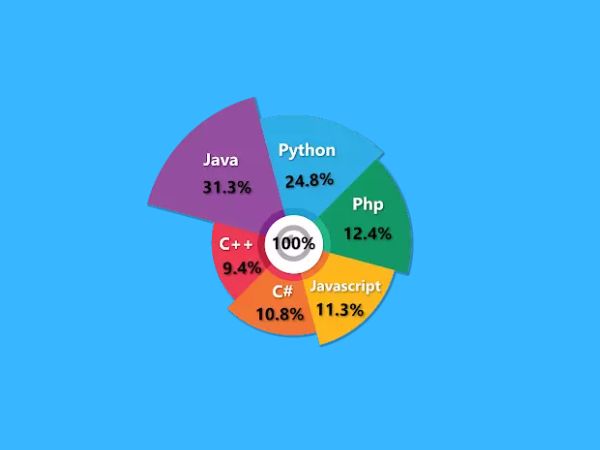
Power BI custom visuals help you create more interactive, engaging, and insightful dashboards than the standard visuals available in Power BI Desktop. Microsoft AppSource provides hundreds of certified custom visuals developed by Microsoft and trusted partners, making it easy to extend your reports with advanced visualizations.
In this guide, you’ll learn how to download and import Power BI custom visuals from Microsoft AppSource using Datellers Nested Total Bar Chart as an example. The same process applies to other custom visuals available in AppSource, helping you quickly enhance your Power BI reports with additional functionality.
Developing Custom Visuals in Power BI
According to how they are used, Power BI custom graphics are typically categorised into three groups.
1. Custom visual files
The. pbiviz files that contain the codes to run custom visuals in your Power BI app are known as custom visual files. Developers produce customised visual codes and save them in files with the .pbiviz extension. These files are downloaded by users or report creators into their systems, where they are then used in Power BI reports.
2. Organizational visuals
The visualisations created specifically for usage within an organisation are known as organisational visuals. Every organisation has distinct work processes or business methods. They need tools and techniques in order to use them for their business needs.
Power BI gives users the flexibility to design unique graphics intended solely for organisational usage. To illustrate data patterns and information that is essential to the organisation, developers within the company might generate specialised visualisations.
3. Marketplace visuals
Custom visuals from Microsoft and other members of the community have been reviewed and approved for use in the marketplace. These unique images are created and published on AppSource. By employing these unique graphics, Power BI customers can discover new facets of their data, which is done as a community service.
Downloading and Importing Custom Visuals from Microsoft AppSource
1. Start your browser and open Microsoft AppSource. Each custom graphic is represented as a tile in AppSource. Each tile includes a screenshot of a unique image, a synopsis, and a download link. Select the tile to get additional information.
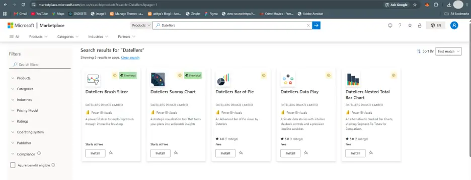
2. You may examine pictures, videos, a thorough description, and more on the detail page. By choosing “Get it now,” you can download the customised graphic. You must accept the Terms of Use in order to download the graphic.
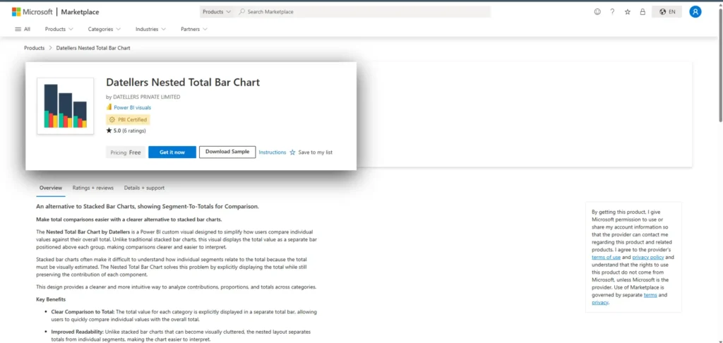
3. Press the button to download the custom visual.
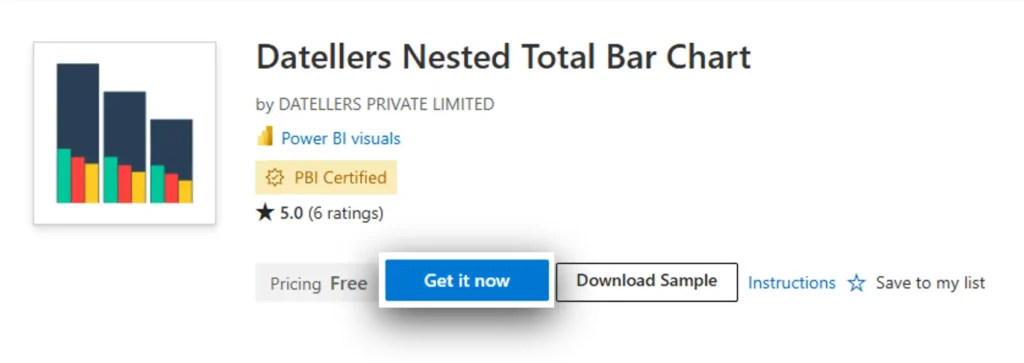
4. Follow Microsoft’s instructions to import the “.pbiviz” file into your report.
5. A sample report that features the custom visual and demonstrates its possibilities is also available for download.
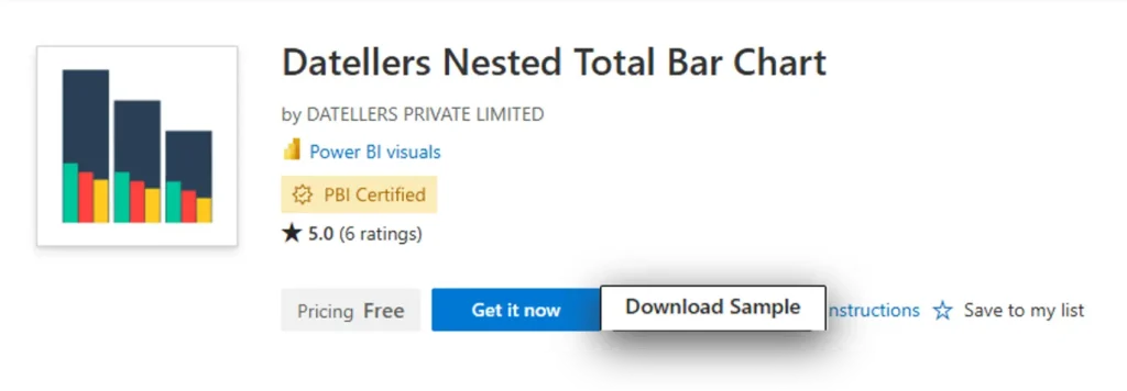
Importing custom visuals from the marketplace
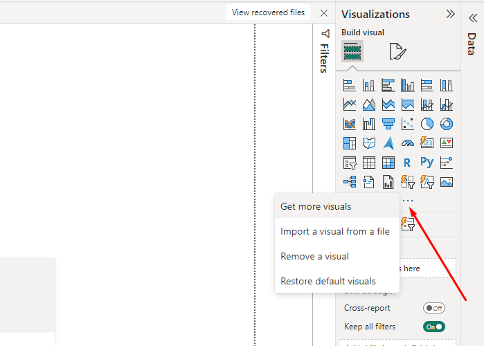
Step 1: In the Visualizations window, select the ellipses icon. Opt for Import from Marketplace.
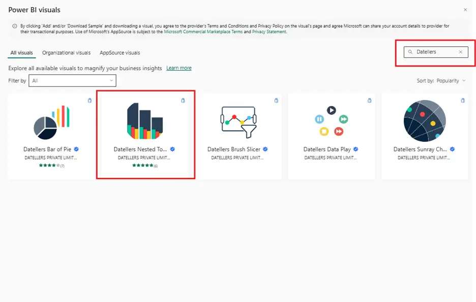
Step 2: The Power BI graphics dialogue box will launch. At the top, there are two tabs: Marketplace and My Organization. Navigate to Marketplace. You will see a list of all the custom visuals that are accessible. Additionally, after choosing a category, you may explore the personalised visuals. Additionally, you can directly type the name of the category or image you’re looking for in the search field.
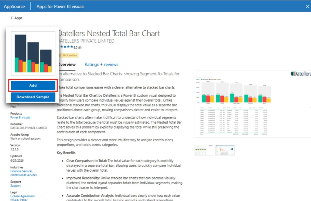
Step 3: From the list, choose Datellers Nested Total Bar Chart, and then click Add. The visual will be added to the Visualizations pane of your Power BI Desktop. For instance, from the appSource, we choose the Datellers Nested Total Bar Chart custom visual.
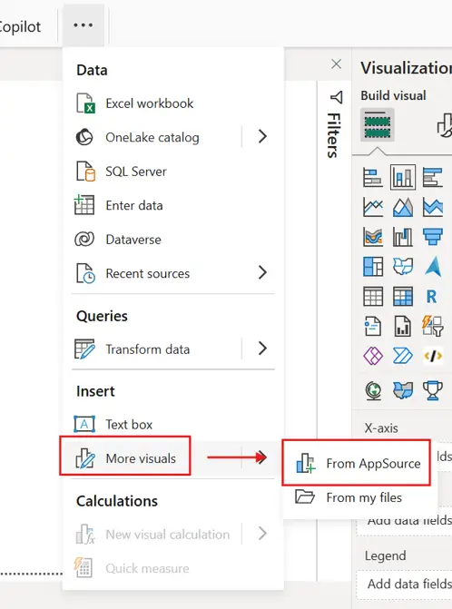
Step 4: There is still another way for you to enter the appSource. Under the Home menu, choose the eclipse and then navigate to more visuals and click there will see “From AppSource”.