The Problem
Your Average Forecast is Hiding the Risk
A client came to us last year with a supply chain dashboard that was entirely green. Reorder points set, safety stock calculated, lead times logged. Then one supplier had a rough quarter — lead times stretched from 15 days to 19 — and three of their best-selling SKUs went out of stock for 11 days. Estimated revenue impact: 4.2% of the quarter
The planning model had a single failure mode. Every calculation used point estimates: average demand × average lead time = expected consumption. That worked on average. But averages don’t tell you what happens when lead time and demand both go wrong at the same time. And in practice, they often do — supply disruptions and demand spikes tend to arrive together.
That’s the problem Monte Carlo solves. Instead of computing one expected outcome, you run the same scenario a thousand times, each time drawing lead time and demand from realistic probability distributions. The result is a full picture of possible futures: how many end safely, how many don’t, and exactly how thin the margin is between the two.
What We Built
A Live Simulation That Lives Inside the Report
Most Monte Carlo tools are genuinely useful and practically ignored. They live in Python notebooks or Excel macros, separate from the reporting layer. A planner has to remember the tool exists, export the right numbers, run it, and paste results back. That loop kills adoption inside of a month.
We built a custom Power BI visual using the pbiviz SDK — Vanilla TypeScript, hand-built SVG, no external charting libraries. The visual is fully self-contained: drop it onto any report page and it immediately runs a live simulation. No data model setup required.
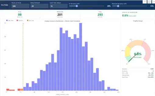
The visual in action: filter bar inputs, P10 / P50 / P90 stat cards, the distribution histogram, Fragility Gauge, and scenario summary table.
How it works
Filter bar Three number inputs at the top (Stock on Hand, Daily Demand, Lead Time Mean) and two sliders (Lead Time Variance CV, Demand Variance CV). Change any value and the visual re-runs 1,000 scenarios instantly.
Histogram Shows ending inventory across all scenarios. Bins below zero are red, bins above zero are indigo, and bins that straddle zero are amber. The amber crossover bin tells you at a glance whether you have a structural stockout risk or just a distribution grazing the edge.
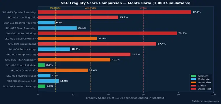
Fragility Gauge Semi-circular arc showing what percentage of scenarios ended in stockout. Green (0–10%) is Resilient, yellow (10–30%) Moderate, orange (30–60%) Vulnerable, red (60%+) Critical. A summary table below shows scenario counts and the variance range for both inputs.
Format Pane Controls scenario count (100 to 10,000), histogram bin count, and colour overrides for the safe and risk zones — so the visual can be themed to match an existing report.
Results
What the Data Actually Showed
We validated against a test dataset of 15 SKUs across five risk tiers. A few results stood out.
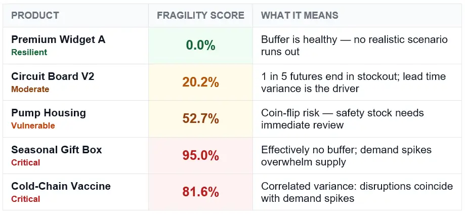
The most instructive case was the Cold-Chain Vaccine SKU. On paper it looked manageable: 120 units in stock, 10 units per day demand, 18-day mean lead time. A traditional model flags the shortfall and you top it up. Monte Carlo gave a different picture entirely.
816 / 1,000
simulated futures ended in stockout
The culprit: 32% lead time variance combined with 15% demand variance. When both go wrong simultaneously — which happens more than planners expect, because disruptions and demand spikes correlate — the math turns ugly fast. The visual made this visible in 30 seconds.
Getting Started
Using the Visual
Import the .pbiviz via Insert → Get more visuals → Import a visual from a file in Power BI Desktop. The visual renders immediately on drop. Then:
If your team manages SKUs with lead times beyond 20 days, supplier variance above 20%, or any history of demand spikes correlating with disruptions — run a Monte Carlo pass on your current positions. Point estimates are almost certainly hiding something. Ours were.