Contents
- What is Process Mining Visual?
- Introducing the Process Mining Visual for Power BI by Datellers!
- How to use the Features in the Process Mining
- Formatting Options in the Process Mining
1. What is a Process Mining Visual?
Process Mining: A data science technique that reconstructs how a process actually ran by analysing the digital footprints (events) it leaves behind in a system, rather than relying on a manually drawn, assumed diagram.
Event Log: The underlying dataset that makes process mining possible. Each row represents one event and must, at minimum, capture a Case ID (which process instance it belongs to), an Activity (what happened) and a Timestamp (when it happened).
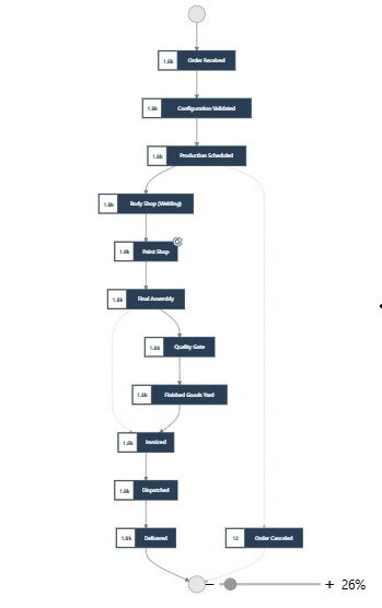
Process Mining Visual: The Process Mining Visual is a custom Power BI visual by Datellers that transforms your event log data into an interactive process flow map. Connect your Case ID, Activity and Timestamp columns and instantly visualise how your process actually runs across every case — not how it was designed to run on paper.
Unlike a standard flow chart, the Process Mining Visual:
- Discovers the real process from your data, not a manually drawn diagram — revealing every path, loop, and deviation cases actually follow.
- Lets you click any activity or transition to cross-filter all other visuals on the page instantly.
- Detects rework loops and skipped steps, highlighting where cases deviate from the expected “happy path.”
Typical use cases include:
Order-to-Delivery
Manufacturing QA
Procurement
Claims Processing
IT Incident Management
HR Onboarding
2. Introducing the Process Mining Visual for Power BI by Datellers!
The Process Mining Visual, Datellers’ latest addition to Power BI Custom Visuals, brings true process intelligence into Power BI. Unlike standard charts, it transforms your event log data into an interactive process flow map — revealing bottlenecks, rework loops, and process variants directly inside your report. You see your process as it runs, not as it was designed.
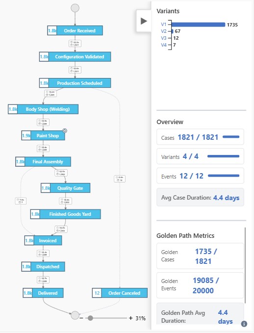
We have packed the Process Mining Visual with an array of features. From an animated Golden Path that traces the dominant route through your process, to a Heat Map that colours every activity by duration or volume, to a Variant Analysis panel that ranks every distinct sequence — the Process Mining Visual aims to elevate the user’s process analysis experience. Additionally, with Zoom & Minimap navigation, exploring even the busiest process graphs becomes intuitive and efficient.
The following is what the Process Mining Visual offers:
- Process Flow Map: Automatically discovers and draws the real process from event log data, revealing every path, loop, and deviation cases actually follow.
- Golden Path: Highlights the single most common route through the process with animated flowing particles and an adoption-rate readout.
- Heat Map: Colours every activity by duration or case count, so bottlenecks and high-volume steps are visible at a glance.
- Variant Analysis: Ranks every distinct end-to-end sequence by case count, with click-to-filter on any variant.
- Zoom & Minimap: Zoom, pan, and stay oriented on large process graphs using a live-viewport minimap.
- Cross-Filtering: Click any activity node or transition to instantly filter every other visual on the page.
- Metric Panels View: A dedicated panel of live overview gauges and transition metrics that summarise the current selection at a glance.
3. How to use the Features in the Process Mining Visual
Populate the visual by Adding the required data in the fields.
There are four fields as follows:
Case ID (required) – The unique identifier for each process instance. Typically an Order ID, VIN, Ticket Number, Invoice ID, or any column that groups related events together.
Activity (required) – The name of each process step or event. This defines the nodes in the process flow map (e.g. Order Received, Quality Gate, Dispatched).
Timestamp (required) – The date and time when each activity occurred. Used to calculate durations, detect delays, and order events chronologically within each case.
Tooltips (optional) – add any additional columns or measures to display when hovering over a node or transition edge, such as Avg Duration (hrs), Total Cases, Delivery Rate %, Resource ID, or any custom DAX measure.
Once the required fields are mapped, the visual immediately renders your process flow map and is ready to cross-filter the rest of the report page.
You can use the following core features:
- Cross-Filtering – The process flow map is built from your Case ID, Activity, and Timestamp fields. When a user clicks or filters an activity node, the visual outputs a cross-filter that applies to every other visual on the page instantly—narrowing charts, labels, and KPI cards to only the cases that passed through that selected step.
- Golden Path – Highlights the single most common route a case takes through your process – the sequence most of your cases actually follow, end to end.
- Every case is reduced to its activity sequence (e.g. “Variant”).
- The most frequent sequence becomes the Golden Path.
- Its edges are drawn as animated flowing particles through the graph.
- The panel shows the adoption rate – what % of cases end events follow it vs. deviate.
- Heat Map – Colours every activity by Duration or by case count, so you can instantly see where cases pile up and where they slow down. Enable it via Format Visual > Heat Map > Show. Darker/warmer colours indicate the highest value (busiest or slowest activity). Lighter/cooler colours indicate the lowest. Switch between Case Count (volume) and Duration (speed) mode, and see Low / Mid / High colours, or turn off the mid colour for a simple two-point scale.
- Variant Analysis – Not every case follows the same path. The Variants panel ranks every distinct sequence by how many cases took it.
- Each unique end-to-end sequence is a “Variant”.
- The panel bar-charts the top variants by case count, with a “Rest” bucket for the long tail.
- Click a variant bar to filter the graph down to just that path.
- Review spikes (Cases / Variants / Events) update live to match your selection.
- Zoom & Minimap – Real process don’t fit on one screen. Zoom, pan, and the minimap keep you oriented no matter how big the graph gets.
- Scroll or drag the zoom slider to zoom in on a busy section.
- Pan by dragging the canvas.
- The minimap (bottom-right) shows the whole graph plus a live viewport box.
- Minimise colours mirror your Heat Map settings.
- Metric Panels View – A dedicated panel surfaces the key numbers behind whatever is currently selected, so you don’t have to build separate KPI cards to read them.
- Overview gauges show live Cases, Variants, and Events counts for the current selection.
- Transition Metrics show per-edge figures such as average duration, frequency, and any optional measures you’ve mapped.
- The panel updates instantly as you click nodes, transitions, or variant bars – no extra filtering steps required.
- Fully formattable from Format Visual > Panel / Transition Metrics – tick formatting, axis colours, gridlines, background fill, and border.
4. Formatting Options in Process Mining Visual
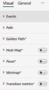
The Process Mining Visual comes with an array of customisations. Following is a list of the formatting options that can be applied to the Process Mining Visual from the Format Visual pane:
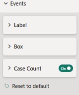
- Events – Expanding ‘Events’ gives the following formatting options:
- Label – Using this user can style activity names.
- Box – Using this user can style Activity box border colour and width, background colour, and box height.
- Case Count – this allows users to style case count background colour and size.
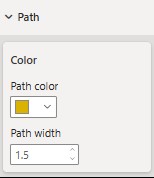
Path – Expanding ‘Path’ gives following formatting options:
- Colour – Allows users to change the colour of the path line.
- Path Width – Allows users to adjust the width of the path.
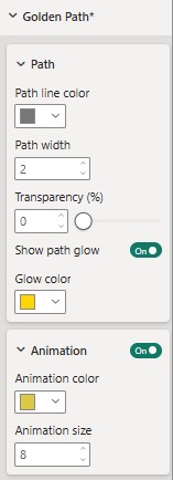
- Golden Path – Expanding ‘Golden Path’ gives following formatting options:
- Path Line Colour – Using this option, you can change the colour of the Golden Path line.
- Path Width – Adjusts the width (thickness) of the Golden Path line.
- Transparency – Controls the transparency level of the path line.
- Show Path Glow – Enables or disables the glow effect behind the Golden Path line.
- Glow Colour – Changes the colour of the path glow effect.
- Animation – Enables or disables the animated flow effect, allowing you to customize its colour and size.
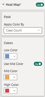
- Heat Map – Expanding ‘Golden Path’ gives following formatting options:
- Field – Select the field to set the rule for heat map colour to apply on.
- Colours – set colour rules for Low, Mid, High Colours, User can use mid colour as optional using ‘Use Mid Colour’ toggle.
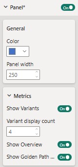
- Panel – Expanding ‘Panel’ Gives following formatting options:
- General – This allows user to adjust colour and panel width
- Metrics – this Enables/ Disable metric panel on right side of the visual.
- Show Variants – This Options allows user to show/hide variants panel .
- Variant Display Count – This option allows user to adjust the number no of visible variants.
- Show Overview – This Options allows user to show/hide Show/Hide Overview
- Show Golden Path – This Options allows user to show/hide Show/Hide Golden Path panels.
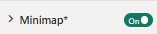
- Mini Map – This allows users to Show or Hide the minimap on right bottom of the visual.
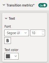
- Transition Metrics – Enabling this option allows users to show metrics on the path between activities
- Text – User can style the text present in the transition metrics using these formatting options.