Contents
- What is a Sunray Chart?
- Sunray Chart Use Cases
- How to use the Sunray Chart in Power BI
- Formatting Options in the Sunray Chart
I. What is a Sunray Chart?
The Sunray Chart is a powerful strategic visualization tool used to display the flow of data, tasks, or processes through different stages or categories. It helps track how tasks or milestones progress across various stages, often with a focus on time, but can also represent any sequence of steps or phases in a process. The chart is particularly useful for showing how work or data is distributed across multiple categories and how it transforms through distinct stages.
Structure of the Sunray Chart
- Column (Stages): The map consists of a column representing the different stages that the process or tasks move through. These stages can be time-based (e.g., year, month) or represent any sequential flow, such as project phases or task milestones. The stages define the sequence in which tasks progress, helping users understand how things evolve from one stage to another.
- Categories: The categories are distributed across two sides of the map—top and right or bottom and left. These categories could represent departments, types of tasks, or other relevant divisions. This division helps balance the flow of data or tasks across the map, providing a clear and organized view of how each category contributes to the overall transformation.
- Nodes: Nodes are placed within specific sectors that correspond to relevant stages or categories. These nodes represent individual tasks, milestones, or key data points. They can be labeled with relevant information such as task names, department names, or metrics. Additionally, nodes can be heatmapped to reflect different levels of importance or status, using color variations to indicate progress or urgency. Nodes may also have different shapes to represent various types of tasks, helping to visually differentiate between categories or task types.
- Additional Elements
- Node Labels: You can add descriptive text beneath each node in the chart. By assigning a relevant field to the node label, the chart will automatically display that value for every data point. This makes it easier to understand the nodes and ensures your chart remains clear and informative.
- Node Icon: You can assign specific icons to nodes in your chart, providing visual cues that help distinguish between categories of data points. By adding a field to the Node Icon, you can control which icon appears for each node making it easy to differentiate nodes by category, status, or any other logic you choose. You can further customize the appearance of these icons using the available formatting options
- Tooltip: Display extra information when hovering over a node in the chart. By placing any field in this section, viewers can see additional details about the nodes without cluttering the visual. This feature helps keep the chart clean and focused while still giving users access to important context. With tooltips, users can view not only the basic node information but also any supplementary details you choose to include.
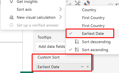
- Custom Sort: The Sort field lets you control the order in which data appears on the chart, whether by node or category. Add a field here to sort by values such as date, score, or any custom order. The field also becomes available under the Power BI Sort Axis option, giving you more flexibility in organizing the visual.
II. Sunray Chart Use Cases
- Project Milestone Tracking: Track project progress across stages like Planning, Design, and Development, showing how tasks evolve through different phases.
- Sales Pipeline Management: Visualize sales leads as they move through stages like Lead Generation, Qualification, and Closed Deal, helping identify bottlenecks.
- Customer Journey Mapping: Track customers through stages like Awareness, Consideration, and Purchase, understanding their journey and areas for improvement.
- Supply Chain Management: Track products or materials through stages such as Sourcing, Manufacturing, and Delivery, helping identify delays in the supply chain.
- Marketing Campaign Tracking: Monitor marketing campaigns across stages like Planning, Execution, and Analysis, helping assess campaign performance.
- Product Development Stages: Follow the stages of product development, from Conceptualization to Launch, ensuring all milestones are met on time.
- Benchmarking Divisions: Comparing the progress of divisions to measure how close they are to achieving a common strategic goal.
III. How to use the Sunray Chart in Power BI?
- Add the required data in the data fields. There are four data fields as follows:
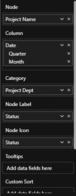
a. Node – Determines nodes within sectors, representing tasks, milestones, or data points.
b. Column – Defines the stages of the Sunray Chart, which can represent a hierarchical structure.
c. Category – Represents the categories of the Sunray Chart, grouping data into distinct sectors.
d. Node Label – An optional field to display text below each node.
e. Node Icon – An optional field to define different node shapes.
f. Tooltips – An optional field to add multiple fields to display in a tooltip when hovering over a node, providing additional details.
g. Custom Sort – An optional field used to sort the data points via Sort Axis in Power BI.
- Try the following features:
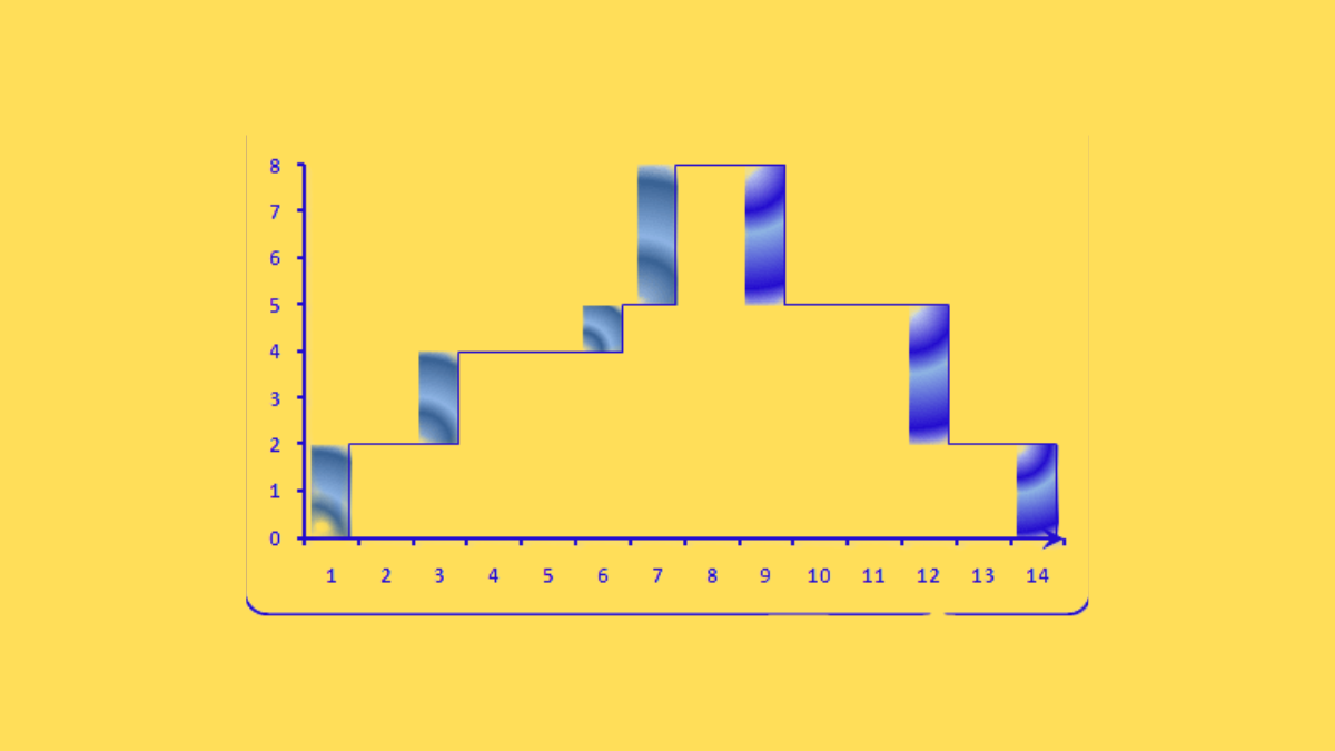
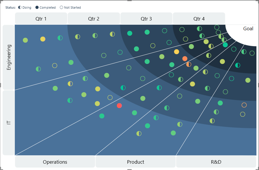
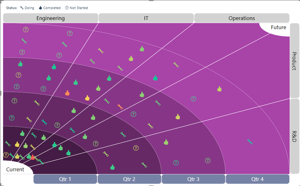
- Converging or Diverging Flow Options: The Sunray Chart can be designed to either converge or diverge, depending on the flow of data. In a converging chart, data points move towards a central point, while in a diverging chart, data flows outward from a central node, providing flexibility in visualizing different types of data relationships.

Figure 1: Converging Sunray Chart
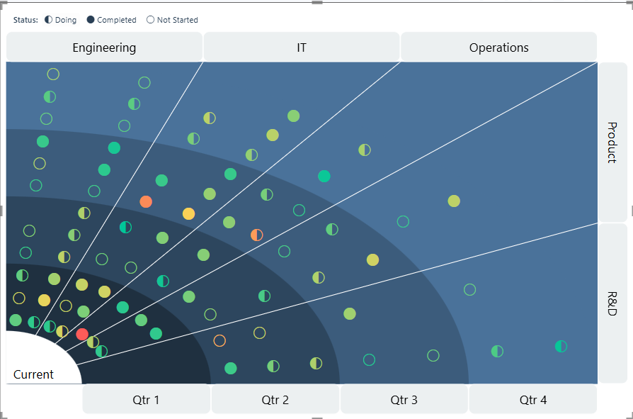
Figure 2: Diverging Sunray Chart
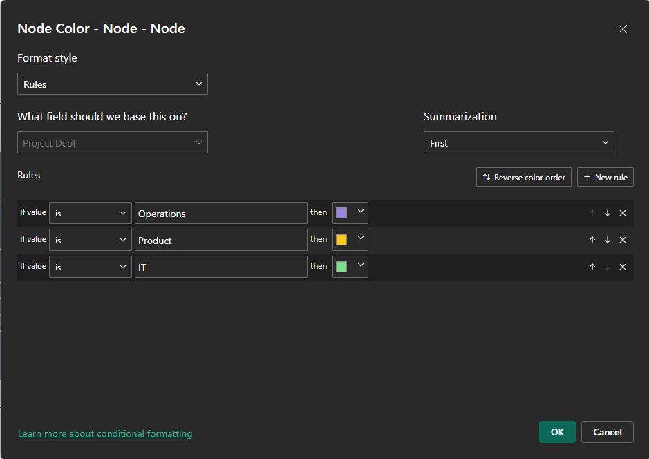
- Conditional Colour Formatting for Heatmapping: The Sunray Chart supports conditional colour formatting, enabling users to apply heatmapping rules based on Power BI’s conditional formatting options. This allows nodes to be dynamically colored based on specific criteria.
- Customizable Node Icons for Clearer Representation: Users can customize the icons used for nodes, offering a variety of options to represent different task types, categories, or statuses. This feature makes it easier to distinguish between different types of nodes visually. For Example:
- Fully Customizable Design with Colour and Font Adjustments: The Sunray Chart is fully customizable, allowing users to modify colours, fonts, and other design elements. This flexibility ensures the chart can be tailored to fit any branding or design preference.
- Custom Sort: Users can add any field to the Custom Sort well and then sort the data using the Sort Axis option in Power BI.
IV. Formatting Options in the Sunray Chart
The Sunray Chart comes with an array of customisations. Following is a list of the formatting options that can be applied to the Sunray Chart from the ‘Format Visual’ pane over and above the General formatting options:
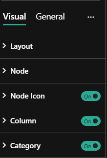
- Layout – Expanding ‘Layout gives the following formatting options:
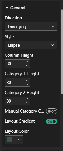
i) General :-
- Direction – Change the flow to either Converging or Diverging
- Style – Change the style of the grid to rectangle or circle
- Column Height – Set the height of the Column/Stages
- Category 1 Height – Set the Side Category height
- Category 2 Height – Set the Top/Bottom Category height
- Manual Category Count – Manually specify the number of categories to be divided between Category 1 and Category 2. When disabled, categories will be split evenly by default.
- Layout Gradient – Enables a gradient effect across your chart layout.
- Layout Colour – Set the background colour for sectors using a dynamic gradient, allowing for a visually appealing layout.
Grid – Expanding ‘Grid’ under Layout gives the following formatting options:
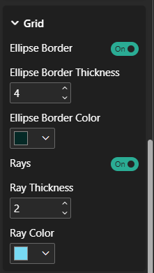
- Ellipse Border – Show/Hide Ellipse borders in the layout
- Ellipse Border Thickness – Set thickness of the ellipse border
- Ellipse border colour – Set the colour for ellipse border
- Rays – Show/Hide Rays in the layout
- Ray Thickness – Set the thickness of the Rays
- Ray Colour – Set the stroke colour of the Rays
State 1 – Expanding ‘State 1’ under Layout gives the following formatting options:
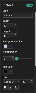
- State 1– Enable/Disable the display of the state 1 at the bottom left.
- Label – Define the label text for the current state.
- Width – Adjust the width of the current state ellipse.
- Height – Set the height of the current state ellipse.
- Background Color – Choose the background color for the current state.
- Transparency – Set transparency to current label background
- Text Color – Select the text color for the current state label.
- Font – Set the font style and size for the current state text. Apply bold, italic, or underline to the current state text.
State 2 – Expanding ‘State 2’ under Layout displays the same formatting options as State 1, shown at the top right with identical settings.
- Node– Expanding ‘Node’ gives the following formatting options:
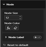
- Node Size – Adjust the size of the nodes in the layout to make them larger or smaller based on your design preference.
- Node colour – Set the colour of the nodes. You can choose from different colour options and use Power Bi’s conditional formatting for Heatmapping.
- Node Label – Expanding ‘Node Label’ under Node gives the following formatting options:
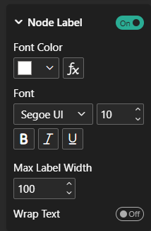
- Font Color – Set the color of the node label text to customize its appearance.
- Font Style – Choose the Font Family and Font Size for the node label text. Apply Bold, Italic, or Underline to the node label text for additional formatting.
- Max Label Width – Adjust the maximum width for the node label text. This controls how wide the label can expand before it is constrained.
- Wrap Text – Toggle this option ON to allow the node label text to wrap to the next line when the text exceeds the set width, or OFF to keep the text on a single line and truncate.
3. Node Icon – Expanding ‘Node Icon; under Node gives the following formatting options:
- Node Icon – Turn Node Icon toggle option to enable or disable node icons.
- Edit Icons – Enable this toggle to open the Node Icon Rules window, where you can assign different icons to each value in the field placed in the Node Icon area. For example, if you add a Product field, you can set unique icons for different products.
- Legend – Can show legend on top left corner with all styling.

- Column– Expanding ‘Column’ gives the following formatting options:
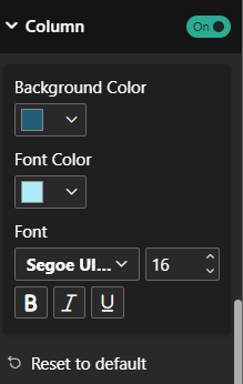
- Column – Toggle to show or hide the Columns in the visual
- Background Color – Set the color of the Column to customize its appearance.
- Font Color – Set the color of the Column text to customize its appearance.
- Font Style– Choose the Font Family and Font Size for the Column text. Apply Bold, Italic, or Underline to the Column text for additional formatting.
- Category – Expanding ‘Category’ gives the following formatting options:
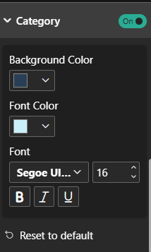
- Category – Toggle to show or hide the Categories in the visual
- Background colour – Set the color of the Categories to customize its appearance.
- Font colour – Set the colour of the Category text to customize its appearance.
- Font Style – Choose the Font Family and Font Size for the Category text. Apply Bold, Italic, or Underline to the Category text for additional formatting.