Contents: I. What is Nested Total Bar Chart? The Nested Total Bar Chart, an alternative to the stacked
- Sivaramakrishna Bolla
Contents I. What is a Sunray Chart? The Sunray Chart is a powerful strategic visualization tool used to
- Shannon
Introduction In today’s competitive world, all sorts of businesses are looking for smarter ways to automate their working
- Archana Ojha
Introduction In today’s commercial world, efficiency is very crucial. And we all seek a helping hand which can
- Archana Ojha
Contents I. What is a Brush Slicer? Brush: A brush is a tool in D3 for interactive data.
- Sivaramakrishna Bolla
Contents 1. What is a Bar of Pie Chart? When users wish to show chunks of a small
- Shannon
Microsoft Power BI is a powerful business intelligence tool that helps you visualize, analyze, and share your data
- Muskan Bansal
Data analytics has become an increasingly important tool for businesses looking to gain valuable insights into their operations
- Muskan Bansal
Data visualizations are powerful tools for presenting complex information in an easy-to-understand format. They can be used to
- Muskan Bansal
Data analytics is a process of examining raw data using statistical and computational techniques to draw insights and
- Muskan Bansal
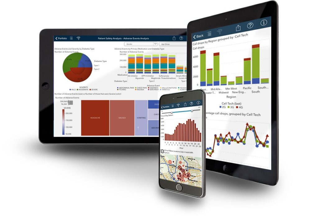
Interactive data visualization for business intelligence and dashboards is a powerful tool that helps businesses gain insights and
- Muskan Bansal
Storytelling in data visualization is a critical aspect of effectively communicating insights from data. The combination of visual
- Muskan Bansal
Over the years, data visualization has become an integral part of data analysis and reporting. As data sets
- Muskan Bansal
data visualization, commonly referred to as “data viz,” has become a crucial component of how companies run, interact
- Muskan Bansal
Data is the driving force behind any organisation in the present market trend in a plethora of different
- Muskan Bansal
Managing data involve a lot of different ideas and variables, which can get confusing. However, data can help
- Muskan Bansal
Data visualization is becoming increasingly essential for any business. It provides a more concrete representation of statistics and
- Muskan Bansal
Power Bi dashboard is one of the most effective tools for data analysis and report creation. Microsoft’s robust
- Muskan Bansal
You have undoubtedly been instinctively visualising a series of positive and negative data that leads to the final
- Muskan Bansal
One of the key elements to improving a company’s success is data analytics and data visualisation. The firm
- Muskan Bansal
As we live in a data-driven era, it is hardly unexpected that analytics is a flaming hot topic
- Muskan Bansal
For a lot of people, the term “data analytics” is novel. You’ve come to the right place if
- Muskan Bansal
Your Power BI report is useless without the appropriate visuals. Understanding when and how to use various visuals
- Muskan Bansal
Over 2.5 quintillion bytes of data are produced every single day, and 90% of all data has been
- Muskan Bansal
Data Analytics is a key component of successful business management. Effective data use helps businesses understand their past
- Muskan Bansal
Power BI is a fantastic tool for businesses wishing to begin, plan, and/or expand their business intelligence activities.
- Muskan Bansal
Many pre-built visualisations for Power BI are accessible in the visualisation pane of both Power BI Desktop and
- Muskan Bansal
As of August 2022, Power BI has added many new features, some of which have been anticipated for
- Muskan Bansal
Power BI is the most talked about analytics tool in the technology space right now. Custom visual is
- Muskan Bansal
Contents 1. What is a Bar of Pie Chart? When users wish to show chunks of a small
- Shannon
Warning and Error Messages are crucial to notify a user about a potential error that may occur inside
- Shannon
Let’s consider a use case where a developers wants to develop a visual where the either requires no
- Shannon
Summary In this article, we will learn how to build a Rich-Text Editor custom visual that supports rich
- Rijo Martin
The Power BI Custom Visual framework provides a lot of flexibility when it comes to sorting your visual.
- Shannon


